Reshma Shirin · UX/UI & Interaction Designer

I turn messy problems into clear, kind products.

~2Nearly two years designing healthcare, MedTech, AR/VR and AI-assisted products. MSc in Interaction & Experience Design, First Class Honours.

Based in Ireland / India
Open to work

Scroll down ↓

What I can help you with

design principles

How I think.

Design for users at their lowest capacity — in pain, anxious, distracted — and the experience works for everyone. My migraine VR work made every ounce of friction visible; that lens never left.

A beautiful screen that breaks under edge cases is not good design. Map the journey, the states, and the interaction logic first — the UI becomes almost inevitable after that.

The wrong word in a health alert causes panic; the right one builds trust. I treat tone of voice as a design system component — with rules, states, and reviews.

Shopify sections, ISO 13485, headset comfort limits, a small team's content capacity — real constraints make design decisions sharper, not smaller. I design inside them, not around them.

Test it, watch it fail, fix it, test again. The best iterations in my work came from being confidently wrong in front of five users.

Migraine-safe VR, post-surgery recovery, UPI behaviour stories, post-screen interfaces — given enough time and the right questions, no problem is too tangled to design for.

about

A little about me.

Hi, I'm Reshma Shirin, and I solve problems for a living. The fun kind: where "it's complicated" becomes "oh, I get it."

Designer by profession, interaction thinker by training, healthcare nerd by choice. I studied Interaction Design in Bangalore, took an MSc in Interaction & Experience Design at the University of Limerick (First Class Honours — thesis on VR for migraine relief), and I'm now deep in Medical Device Technology & Business at Griffith University, learning why regulated products are the ultimate design constraint.

My happy place is the intersection of care and craft: healthcare flows that calm people down, immersive experiences that respect the body, AI features that earn trust instead of demanding it. When I'm not pushing pixels, you'll find me at the water's edge, chasing a new trail, three hours deep in a playlist, hunting down FOOOODD worth photographing — or photographing everything else.

~ Reshma Shirin

degreeMSc Interaction & Experience Design · University of Limerick · First Class Honours
nowPG · Medical Device Technology & Business · Griffith University, Ireland
certifiedUsability Analyst (HFI) · CSPO · AI for Designers (IxDF) · ISO 13485 · Lean Sigma Green Belt
focusHealthcare UX · MedTech · AR/VR · AI-assisted product design
when I'm not designing

Life between pixels.

🌊beaches ⛰️adventure 🎧music on loop 🍜FOOOODD 📷photography

The best design ideas often come from stepping away. Whether I'm at the water's edge, trying a new restaurant, or deep in a playlist — those moments fuel the curiosity and empathy that shape my work. — shot on life, developed into design


RS · 35MM · 01A
🌊your photo here
At the water's edge
the water's edge01
RS · 35MM · 02A
⛰️your photo here
Adventure day
above the clouds02
RS · 35MM · 03A
🛕your photo here
Temple gopuram
temple town03
RS · 35MM · 04A
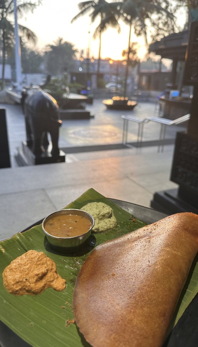
🍜your photo here
Food worth photographing
FOOOODD04
RS · 35MM · 05A
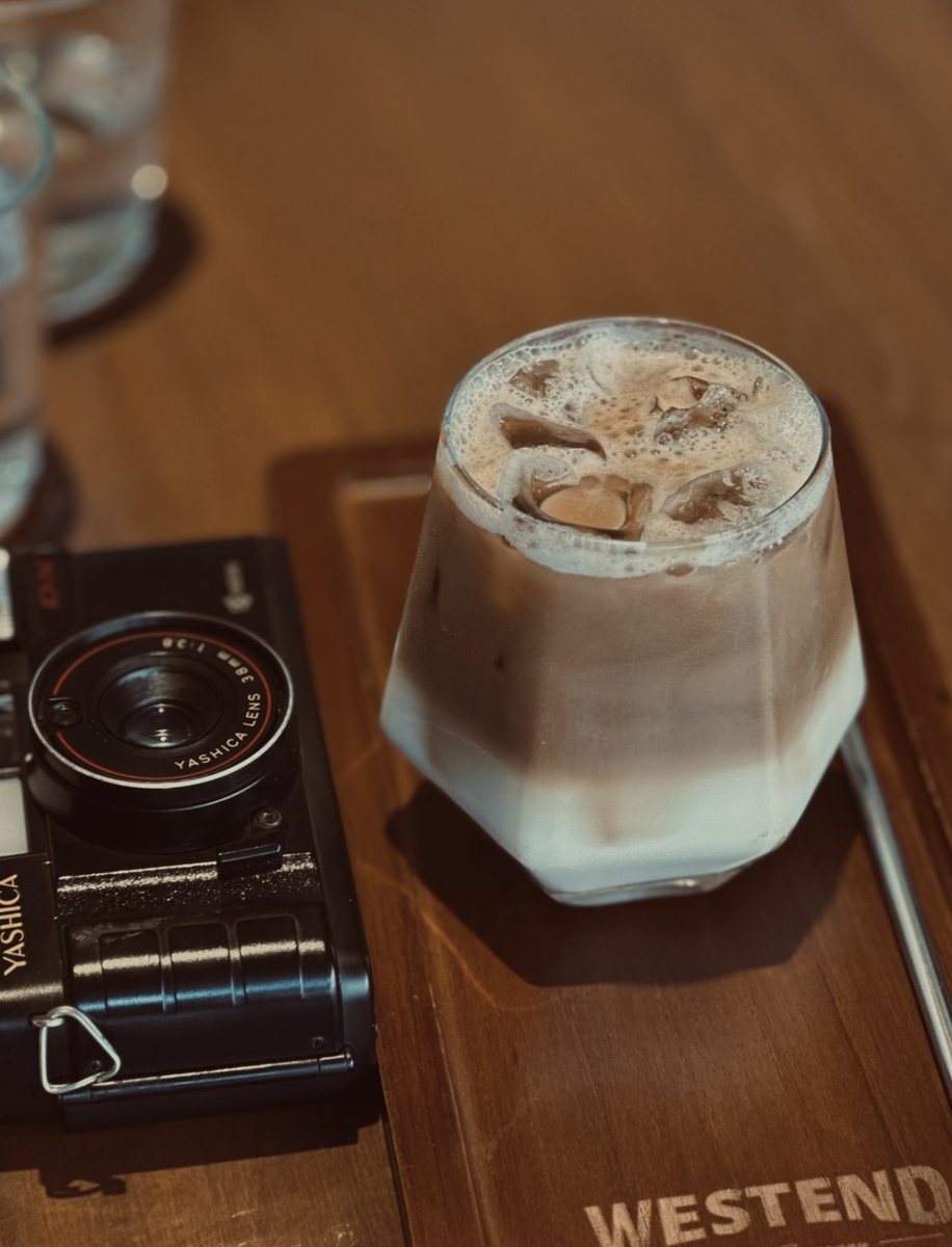
📷your photo here
Through my lens
coffee & film05
RS · 35MM · 06A
✨your photo here
Red evening sky
after the rain06
RS · 35MM · 07A
🏛️your photo here
Old stone building and wires
city lines07

hover to pause the reel

experience

Where I've worked.

Present · ongoing
Growish Digital Freelance Visual Graphic Designer & Interaction Designer · current
  • Designing social creatives and illustrated posts for The Donuts Bakery & Café and Burgundy Coffee
  • Managing clients through Growish Digital, from brief to delivery, across 3–4 more brands at the same time
  • Working fully remotely, balancing several brand voices and deadlines in parallel
Remote
01/2023 — 08/2023
WoooW Reality Associate UI/UX Designer
  • Created high-quality 3D models, textures, and animations for diverse projects
  • Conceptualised and developed UI designs with the design team
  • Worked with developers to integrate designs into functional applications
  • Ran multiple projects in parallel without dropping quality or deadlines
Coimbatore, IN
08/2022 — 12/2022
XR Labs UI/UX Intern
  • Client work for Toyota, Amneal, Intel, and Etisalat Dubai
  • User research via surveys and interviews; analysed data for pain points
  • Wireframes and interactive prototypes in Sketch and Adobe XD
  • Designed web app interfaces and ran usability testing sessions
Chennai, IN
02/2022 — 06/2022
Daimler AG UI/UX Intern
  • Worked on Project 1-G3C Tool, logo, brochure, and DICV Farm
  • User flows and journey maps to expose key touchpoints and friction
  • Heuristic evaluations and cognitive walkthroughs; pushed for accessible, inclusive experiences
  • Wrote design specifications for development teams
Chennai, IN
education

Where I learned.

2025 — present
Griffith University Postgraduate — Medical Device Technology & Business. Regulatory requirements, quality management systems, compliance-driven product development.
Limerick, IE
08/2023 — 09/2024
University of Limerick MSc Interaction & Experience Design. Thesis: Exploring VR for Relaxation During Migraine Episodes. 3D, AR/VR, mobile app design, interactive media, AI. First Class Honours
Ireland
06/2019 — 12/2022
Strate School of Design BSc Interaction Design · Jain University, Bangalore. First Class
Bangalore, IN
toolkit

What I work with.

UX & Product

Wireframing · Interaction Design · User-Centered Design · Information Architecture · Journey Mapping · Design Systems · Pattern Libraries · Inclusive Design

UI & Visual

Visual Design · Typography · Color Theory · Responsive Web · Component Libraries · Material Design · UI Documentation

Research & Strategy

User Research · Interviews · Usability Testing · Heuristic Evaluation · Competitive Benchmarking · Stakeholder Workshops · Experience Mapping

Tools

Figma · Adobe XD · Sketch · Miro · Illustrator · Photoshop · After Effects · Premiere Pro

Emerging Tech

Virtual Reality · Augmented Reality · 3D Modelling · Unity 3D · Blender · Rhino 3D · Maya 3D · AI for UX & Product Design

Healthcare & MedTech

ISO 13485 · FDA Regulations · Medical Device Design Cycle · Connected Health · Healthcare UX Research · Medical Data Integrity

ISO 13485 — QMS for Medical DevicesSGS · May 2026
Lean Sigma Green BeltSGS · May 2026
AI for Product OwnersScrum Alliance · May 2025
Certified Scrum Product OwnerScrum Alliance · May 2025
AI for DesignersIxDF · Mar 2025
Adv. Certification — Innovation & Experience DesignMIT ID · Mar 2023
Certified Usability AnalystHFI, USA · Apr 2023
contact

Let's design something
clear & kind.

Need someone to untangle your UX headaches? That's me. I'm open to UX/UI, Product Design, Interaction Design, Healthcare UX, MedTech UX, AR/VR UX, and AI-assisted product design roles. Let's chat — about your product, or about why calm interfaces will win the next decade.
← back to work VRM · RESHMA · MSc Thesis · University of Limerick, 2024

Exploring VR for Relaxation During Migraine Episodes.

can immersion be gentle?

A VR relaxation prototype exploring whether a fully customisable, low-stimulation environment can help migraine sufferers relax and manage discomfort during an episode — without asking too much of a body that's already struggling. My MSc thesis in Interaction & Experience Design at the University of Limerick, submitted August 2024, built and evaluated with real migraine sufferers through surveys, interviews, and hands-on user testing.

roleUX Researcher & Interaction Designer
contextMSc Thesis · University of Limerick
toolsUnity · XR Interaction Toolkit · C# · Figma
platformVR headset · immersive
UX ResearchMixed-Methods StudyVR Interaction DesignUsability TestingDigital Health
forest · dark room · starry night
Moonlit Japanese garden from the VR environment

"How can Virtual Reality technology be utilised to enhance relaxation and manage migraine symptoms?" — the thesis research question

problem space

Widely experienced. Narrowly treated.

Migraine affects an estimated 12% of the global population and is a significant cause of disability, particularly for women and people aged 18–44. Yet the tools available to sufferers are either pharmacological, come with real side effects, or simply don't reach the moment an attack is actually happening.

01
Prevalent, disabling, under-addressed

Roughly 1 in 8 people worldwide live with migraine, yet comprehensive relief — beyond just the headache — remains rare.
02
Acute treatments, real trade-offs

NSAIDs and triptans relieve pain but carry gastrointestinal or cardiovascular risk, and overuse can itself trigger chronic headache.
03
Preventives take months to work

Beta-blockers, antiepileptics and antidepressants can help, but often bring fatigue, weight gain or cognitive side effects along the way.

04
Non-pharmacological options exist — thinly

CBT, biofeedback and relaxation techniques help but rarely address the biological mechanisms alone, and guidance on them is inconsistent.

05
VR is proven elsewhere in healthcare

VR already supports rehabilitation, exposure therapy and acute pain distraction — but migraine-specific VR remained largely unexplored.

06
An episode changes what's possible

Photophobia, phonophobia, nausea and cognitive fog mean any tool offered mid-attack has to ask very little of the user.

research question & objectives

How might we…

hmw 01

Design VR environments specifically tailored to the sensory needs and triggers of migraine sufferers?

hmw 02

Understand which visual, auditory and interactive settings migraine sufferers actually want control over?

hmw 03

Test a working VR prototype with real migraine sufferers and use their feedback to shape the next iteration?

research

A mixed-methods study, grounded in real experience.

Quantitative and qualitative methods combined to understand migraine experiences, current coping strategies, and reactions to a working VR prototype — not just design assumptions.

30
Survey respondents

An online survey capturing migraine severity, current management strategies, and openness to VR as a tool.

5
Semi-structured interviews

In-depth conversations exploring triggers, symptoms, daily-life impact, and reactions to the idea of VR relief.

5
User testing sessions

Hands-on sessions with the working prototype, walking through real tasks inside the headset.

—
Literature review

Migraine treatment research, VR in healthcare, VR for pain management, and VR-biofeedback systems.

key insights

Four themes from the thematic analysis.

1
Light was the most consistently reported trigger

design opportunityFull brightness and colour-temperature control, defaulting toward dimmer, warmer tones rather than a bright default.

2
Sound sensitivity meant audio had to be optional, not just adjustable

design opportunityA one-tap mute reachable at any point, not buried inside a settings menu.

3
A migraine already impairs patience and comfort

design opportunityA genuinely lightweight headset framing, plus a single, unmissable way to exit the session.

4
Participants over 35 struggled most with icon-only navigation

design opportunityA guided avatar or first-time tutorial, flagged as the top request for future iterations.

from the interviews

Five very different relationships with pain.

🧑
Participant 1migraine since high school · triggers: hormonal cycle, cold wind, wet hair

Has learned her own triggers well — always carries an umbrella, wears a hat in the wind, and times medication around her cycle — but still loses whole days when a migraine hits, and has cancelled plans with friends because of it.

what they wanted
  • Voice control to dim lights or play calming sound
  • Small interactive touches, like gentle distraction elements
  • A headset light enough not to add to the pain
what worried them
  • The weight and comfort of the headset itself
  • Whether VR would help both during and before an attack
  • Sessions running too long without an easy way to leave

"I'm curious about how VR could help during a migraine — but I'm concerned about the weight and comfort of wearing a headset."

🧑
Participant 5nurse · migraines roughly once a week · triggers: cold wind, night shifts

On her feet all day at work, so a migraine mid-shift means leaving early and letting colleagues down. At home, copes by finding somewhere warm and quiet — tracking apps never stuck, since the last thing she wants mid-attack is to touch her phone.

what they wanted
  • Full control over brightness and sound levels
  • A dark, quiet space she can customise herself
  • To use it lying down, at home, not at work
what worried them
  • Visuals or sound feeling overwhelming when already in pain
  • A headset heavy enough to add strain
  • Sessions that feel like a commitment rather than something to dip in and out of

"I don't want anything heavy on my head when I'm already feeling like crap."

design considerations

Built around a body that's already struggling.

Three principles carried through every design decision, drawn directly from the research findings.

User comfortany position works

Sit, stand, or lie down — the 360° environment adapts via a camera-height offset, so no position is "wrong."

Quick exitone press, always

A single press of the home button exits the session and returns to the main menu at any time.

Minimised triggersstable, not stimulating

No flickering lights or sudden noise. Only 360° rotation and subtle animation — falling leaves, gentle light — nothing more.

the three core features

Tone. Sound. Environment.

Rather than one fixed "relaxing" scene, the prototype gives users direct control over the three elements the research flagged as most personal to each person's triggers.

Tone adjustment
  • Swipe to shift cooler → warmer light
  • Eases light sensitivity in the moment
  • Controlled via in-scene white balance
Soundscape options
  • Forest sound, gentle music, or birds chirping
  • Volume slider plus a one-tap mute
  • Silence is a valid choice, not a fallback
Environment switching
  • Calm forest, dark room, or starry night
  • Swipe or tap to change scene anytime
  • 15-minute timer returns to home automatically
Position & exit
  • Sit, stand or lie down at setup
  • Camera offset adapts to the choice
  • One press of home always exits
the user journey

From headset-on to session end.

flow — a full VR relaxation session
Headset on, choose position→ Pick an environment→ Adjust tone, cooler ↔ warmer→ Choose a soundscape or mute→ Migraine tips available anytime→ Auto-timeout or one-press exit ✓
the product

Inside the headset.

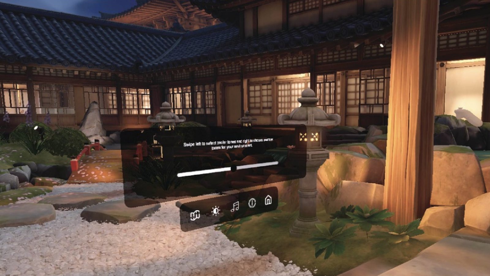
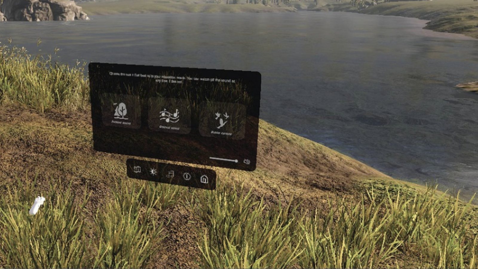
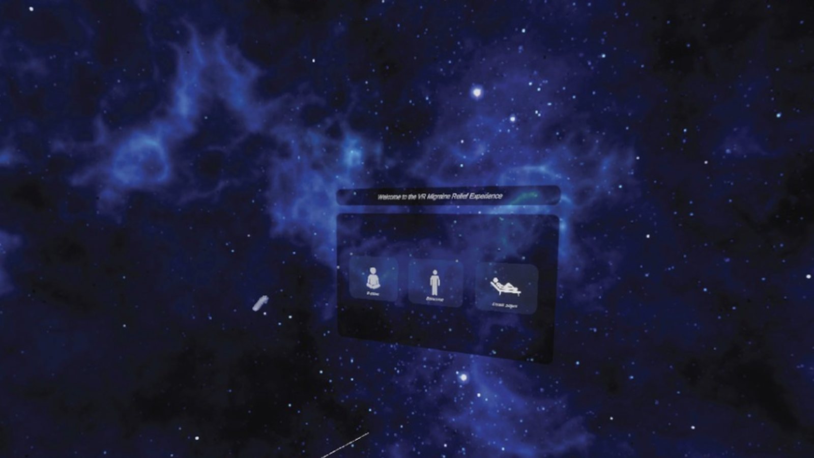
What a participant sees: a calm starting scene, a floating menu that stays out of the way, and large, minimal controls for sound, tone, tips and a one-press exit.

2
Forest scene with the soundscape menu
Choose a soundscape

Forest sound, gentle music or birdsong, with a volume slider and an always-available control bar.

3
Starry night welcome menu
Pick your position

The welcome screen asks whether to sit, stand or lie down, so the camera height fits the body.

4
Garden scene with the tone slider
Warm or cool tone

Swipe to shift the light cooler or warmer, tuned to each person's light sensitivity.

the environments

Built and lit in Unity.

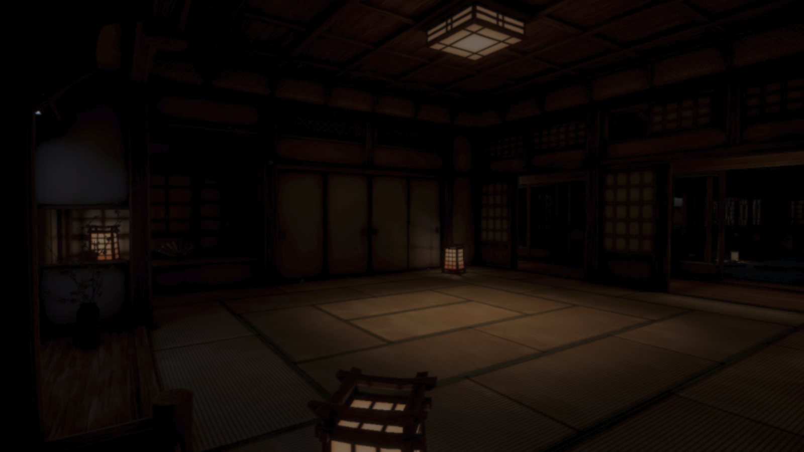
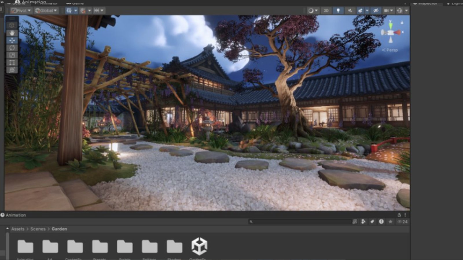
The garden at night, a dark tatami room and the Unity scene view: each environment was built to look appealing while staying low-stimulation.

5
Japanese garden at night environment
Garden at night

Moonlit courtyard with soft lantern light and only gentle, slow motion.

6
Dark tatami room environment
Dark room

A near-dark space with warm lantern light, for the most light-sensitive moments.

7
Garden scene open in the Unity editor
In the Unity editor

The garden scene in the Unity scene view, with the project's scene assets below.

visual design system

Three environments, one calm language.

Forest, dark room and starry night were each built to be visually appealing but low-stimulation — subtle animation only, nothing that risks acting as a visual trigger.

Forest green#4C6B4F
Starry night indigo#2A2B52
Dark room amber#5C4A2E
Sky lavender#7A6BC4
Warm lantern glow#F5D98F
Near-black base#0D0C1E

sensory-safe build rules

  • No flickering lights, strobing, or sudden loud sounds anywhere in the build
  • Motion limited to 360° rotation plus subtle animation — moving leaves, gentle light shifts
  • Built in Unity with the XR Interaction Toolkit; UI logic, audio and scene transitions handled in C#
  • Interface designed in Figma with large, minimal icons for users with limited VR experience
user testing

Five participants, real feedback.

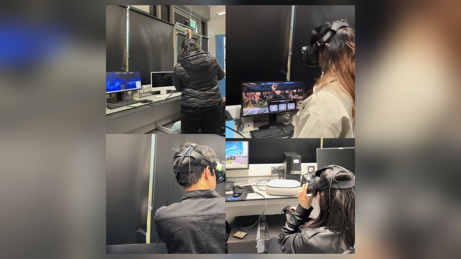
Each participant put on the headset, chose a position, selected an environment, adjusted tone and sound, checked the migraine-tips section, then exited — while being observed for friction points.

1
Participants wearing VR headsets during user testing
User testing sessions

Four participants trying the prototype in the lab, each working through the same tasks while being observed.

friction

Several participants said the headset felt heavy after extended use. Noted for future iterations: a lighter, more ergonomic headset design.

confusion

Icon-only navigation was unclear for some, especially participants over 35. Top suggestion: a guided avatar or short tutorial for first-time users.

positive

The quick-mute soundscape control was called out as essential for managing sensory overload during a migraine.

iteration

Multiple participants wanted more environments and soundscapes to choose from. Flagged directly for the next version of the prototype.

concern

A couple of participants worried about exiting by accident. Suggested addition: a brief confirmation prompt before leaving a session.

outcome & reflection

What this thesis contributed.

"Migraines are highly individualised — what works for one person may not work for another." — a finding that shaped every feature decision

the result

A working VR prototype — evaluated with real migraine sufferers, not just designed around assumptions — that treats customisation, comfort and simplicity as the three load-bearing requirements of a therapeutic VR tool. Positioned as a non-pharmacological option, not a replacement for medical care.

learnings

  • Customisation isn't a nice-to-have here — migraine triggers are individual enough that a fixed "relaxing" scene would fail most users
  • Usability details most designers treat as minor — headset weight, icon clarity, exit visibility — directly determine whether a therapeutic tool gets used at all
  • Guided onboarding matters most for exactly the users who need the tool most: older, less VR-familiar sufferers mid-episode

MSc thesis, University of Limerick (Aug 2024) — findings from 30 survey respondents and 5 interview/user-testing participants, framed as design-research insights, not clinical claims.

next story

MedCare Companion

Turning discharge chaos into one calm daily checklist for cardiac recovery.

Read next →
← back to work MED · RESHMA · Healthcare UX · MedTech · Self-initiated concept

A calmer first 30 days after stent surgery.

recovery, one clear step at a time

MedCare Companion helps people understand what comes next in recovery, with clear daily actions, safer guidance, and caregiver support on the patient's terms.

projectSelf-initiated concept
roleEnd-to-end UX/UI & research
platformAndroid · 412 × 917 design frame
timeframeApprox. four weeks
toolsFigma
Healthcare UXAndroid Product DesignCaregiver ConsentAccessibilityResponsible Design
MedCare screens

Design thesis: recovery should feel like a sequence of manageable daily actions, not a second discharge document.

View the Figma file ↗

01 · the challenge

Good instructions mean little if they're hard to act on.

After coronary stent surgery, patients may return home with medicines, readings, appointments, activity guidance and uncertainty about warning signs. The information is important, but it is often scattered across paper, messages and memory.

01
Answer "What now?"

Make the next essential action visible on the first screen.

02
Respect independence

Caregivers can offer support without unrestricted access.

03
Keep help close

When someone is worried, emergency pathways should be unmistakable.

02 · research & synthesis

People wanted a daily answer, not a feature menu.

The project notes report four caregiver conversations, two patient conversations, one healthcare-provider conversation and a competitive-pattern review. I synthesised six recurring areas of friction into design decisions.

01 · medicine uncertainty
"Did I already take it?"

Group medicines by time and make completion reversible.

02 · fragmentation
Too many sources

Prioritise today's actions, not every available feature.

03 · symptom anxiety
Unclear escalation

Offer clear emergency contact access without diagnosing.

04 · reading ambiguity
Numbers without context

Record requested readings without declaring them normal or high.

05 · caregiver overload
Reassurance, not surveillance

Share a minimal status with explicit patient permission.

06 · accessibility
Dense, difficult controls

Use readable text, consistent actions and generous touch targets.

RESEARCH INTEGRITY · Interview counts and synthesised themes are recorded in the project brief. Raw transcripts, participant quotations and recruitment documentation were not available for independent verification.

03 · who this is for

Two people. Two kinds of reassurance.

patient · RajanAge 60 · recovering from stent surgeryWhat do I need to do today?

Managing multiple medicines and using reading glasses. He needs to know what to do today without asking his daughter to interpret every instruction.

Design rule: completing daily tasks must not depend on family assistance.

family caregiver · AnithaAge 32 · working full-timeIs the important stuff being done?

Supporting her father while working. She wants confidence that important tasks are being addressed, without constant calls or access to every health detail.

Design rule: caregivers see only what Rajan chooses to share.

These personas synthesise project research themes; their descriptions and the lines above are illustrative, not verbatim interview quotes.

04 · approach

Four weeks, from ambiguity to action.

week 01 · discover
Find the friction

Patient and caregiver conversations, early assumptions, competitor patterns.

week 02 · define
Make the problem legible

Research synthesis, journey mapping, personas and navigation priorities.

week 03 · design
Prioritise key tasks

Patient and caregiver flows, medicine states, consent and accessibility.

week 04 · evaluate
Refine interactions

Small usability review, terminology changes and iterative decisions.

The product promise→Open the app→See what's next→Complete it→Understand what changed ✓
05 · the solution

Show what matters. Let everything else wait.

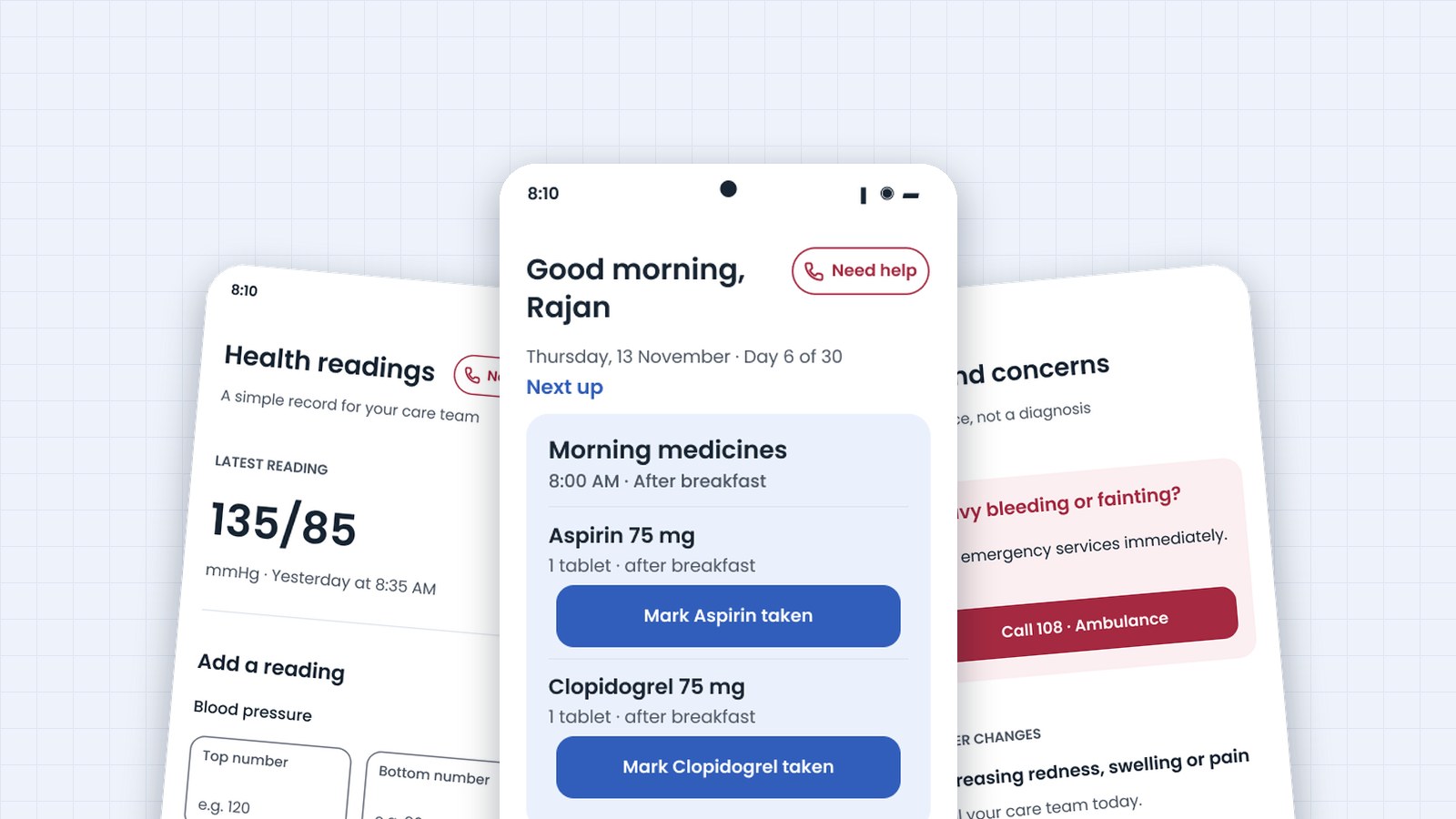
Four-tab navigation (Today, Medicines, Readings, Plan) keeps high-frequency tasks accessible. Today leads with the two morning medicines, while recording and undo states make each action understandable.

01 · daily focus
Today

The next two medicine actions appear immediately.

02 · clear task
Due

A time-grouped list with a separate action per dose.

03 · error recovery
Taken + Undo

A timestamp and reversible action avoid uncertainty.

the screens

Twelve screens. One focused recovery experience.

The patient app and the family companion, shown as flows rather than isolated screens. Clinical content shown is illustrative and would need clinician review before launch.

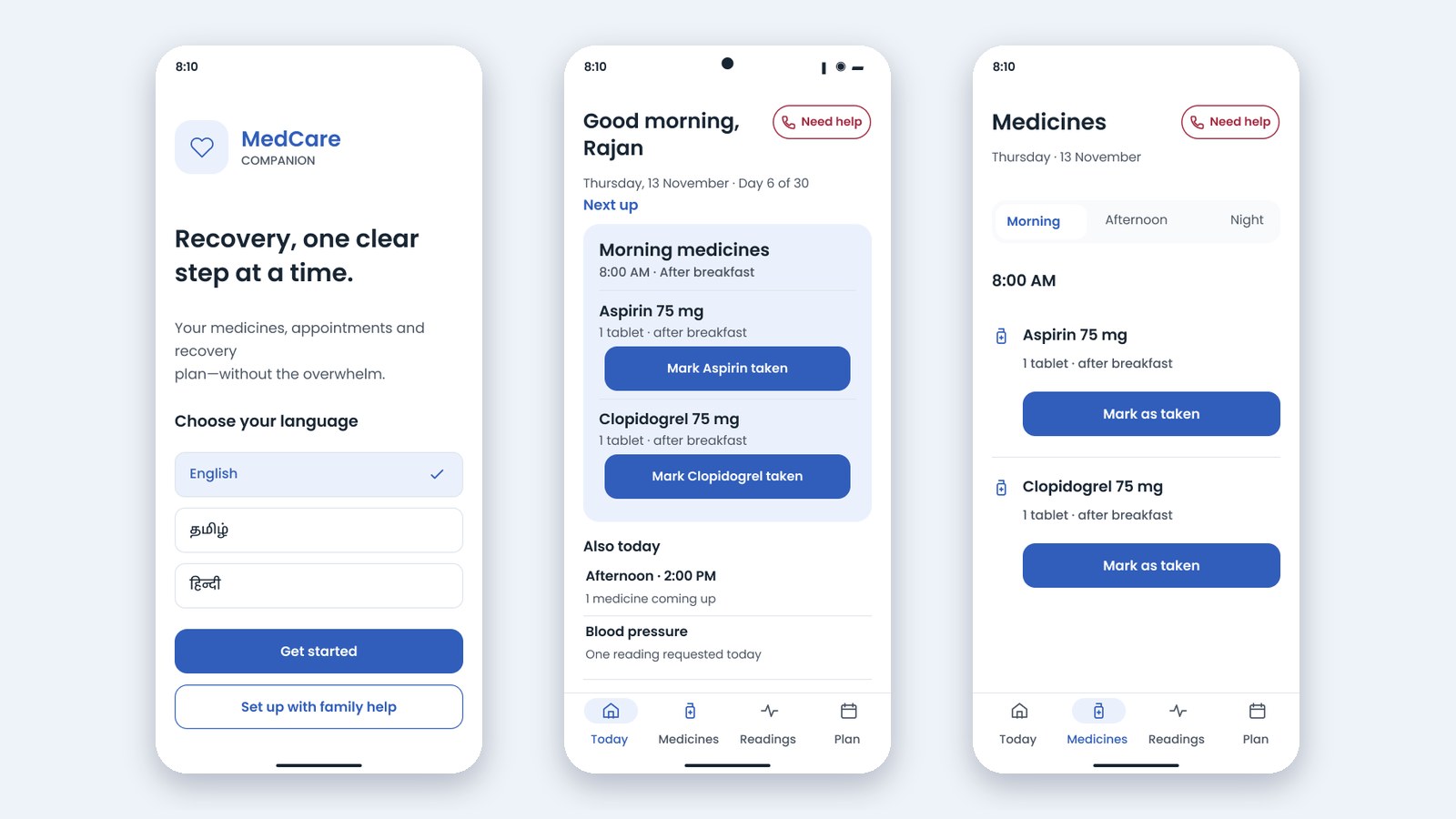
01
MedCare welcome, Today and Medicines screens
Welcome, Today & Medicines

Language choice and a family-help option up front; a Today view with the next medicines and one-tap “Mark taken”; a morning, afternoon and night schedule.

02
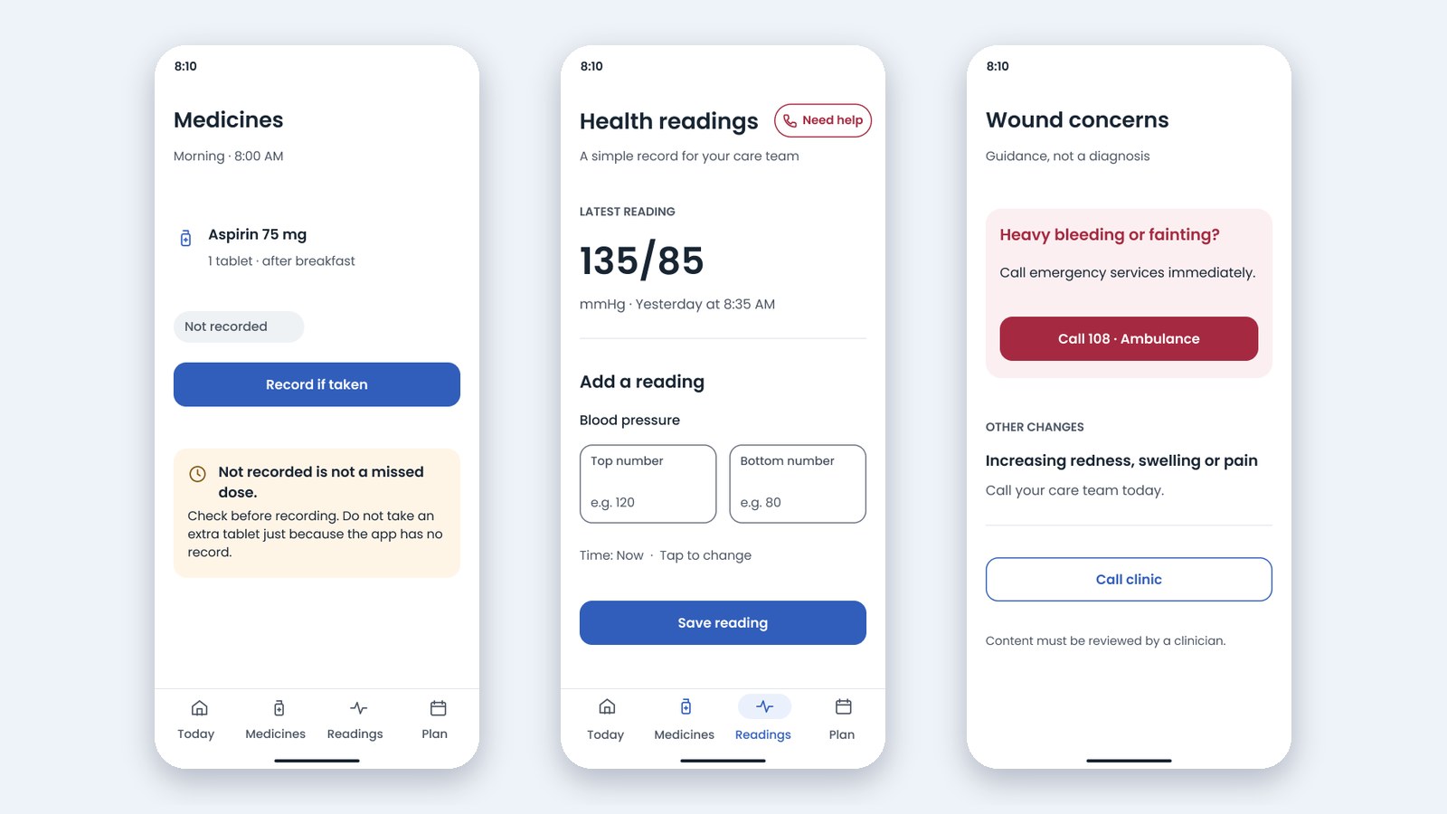
MedCare not-recorded, readings and wound concerns screens
Safe recording, readings & wound concerns

“Not recorded is not a missed dose”; a blood pressure record in plain fields; wound guidance with a clear emergency call, marked as guidance and not a diagnosis.

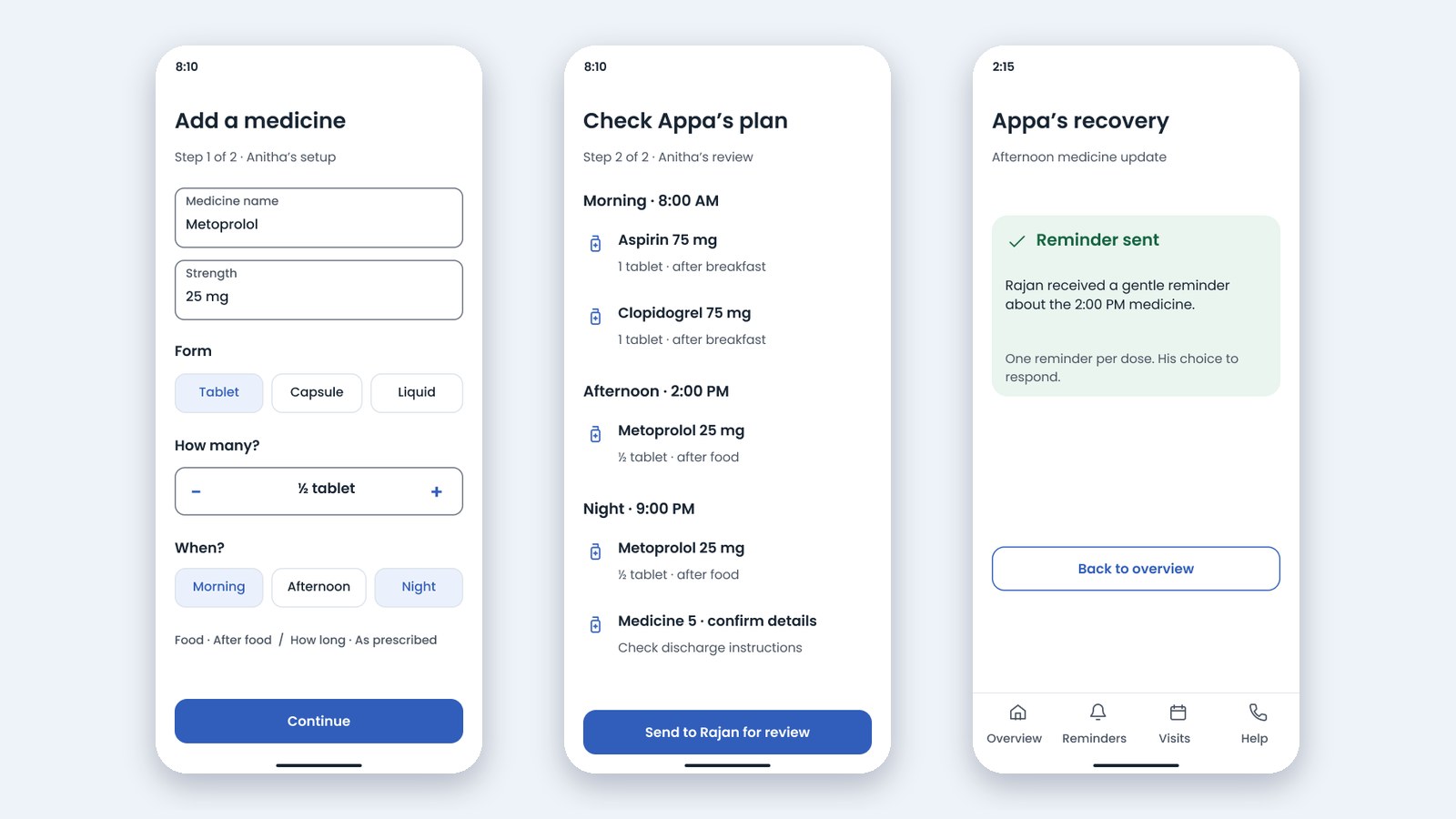
03
MedCare add medicine, review and reminder screens
Family setup & review

A caregiver adds a medicine step by step, checks the plan, sends it to the patient for review, and can send one gentle reminder per dose.

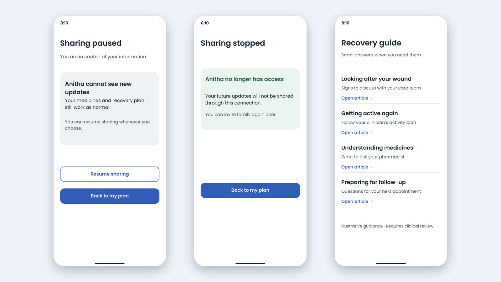
04
MedCare sharing paused, sharing stopped and recovery guide screens
Control & guidance

The patient can pause or stop family sharing at any time; a recovery guide offers small answers, flagged as illustrative and needing clinical review.

06 · caregiver UX & consent

Family support should never feel like surveillance.

The caregiver view is intentionally limited. Rajan decides which statuses are shared, can pause or stop access, and must confirm his medicine plan before reminders begin.

permissioned overview
What Anitha can see

Important statuses and update timestamps, not a clinical dashboard.

patient control
Family sharing

Private notes stay private; permission can be changed.

explicit autonomy
Review before confirming

Patient approval is the boundary for assisted setup.

Caregiver enters plan→Patient reviews→Patient confirms→Reminders may begin ✓
07 · safety & accessibility

Readable in a difficult moment.

Calm does not mean hiding urgency. Emergency contact access uses high contrast, the app avoids diagnoses, and important actions are large enough to reduce precision demands.

find help quickly
Emergency pathway

Urgent contact options come before explanatory content.

no automated reassurance
Health readings

Log clinician-requested numbers without unapproved labels.

text scale
Larger text

A design illustration, not yet verified dynamic-type support.

08 · visual design system

Quiet colour. Confident actions.

An accessible action blue anchors primary controls, while soft blue surfaces organise information without heavy borders. Urgent red is reserved for emergency routes; green is paired with explicit success labels.

Action blue#315EBB
Soft blue#EBF1FC
Ink#152637
Canvas#F9FBFD
Success#176542
Urgent#A52A41

TYPE · Case-study editorial: Inter display + Inter body. App interface: Poppins UI on a 412 × 917 frame with 24 px side margins and 56 px primary actions.

09 · testing & iteration

Small changes. Meaningful decisions.

The project notes record five participants, six tasks and four iteration rounds. The evidence supports specific changes, but not numerical claims about improved adherence or clinical outcomes.

1
Small medicine controls

changed toLarger, clearly labelled medicine actions.

2
"Vitals" felt unfamiliar

changed to"Health readings".

3
Emergency guidance was buried

changed toA persistent "Need help" entry point.

4
Caregivers needed a summary

changed toA distinct, permissioned overview.

EVIDENCE BOUNDARIES · The original archive does not include full moderator notes, raw task timing, participant quotes or verified before-and-after screenshots. The changes above are documented rationales, not measured improvement percentages.

10 · the wider experience

Critical states matter too.

Not recorded. Stale data. Sharing paused. Warning guidance. These are trust-defining moments, not secondary decoration. The Figma file holds 22 original screens.

state
Not recorded

Unknown is not the same as missed.

state
Stale update

Show when information may be outdated.

state
Sharing paused

Respect a patient's decision.

state
Help topic

Keep escalation clearer than diagnosis.

11 · reflection

The hardest part wasn't adding features. It was deciding what to remove.

MedCare reinforced that responsible healthcare UX is built on understandable actions, clear boundaries and the ability to recover from mistakes. A smaller daily interface can create space for the moments that matter most.

next · 01
Verify research evidence

Review consent, original tasks, anonymised notes and recorded iterations.

next · 02
Seek clinical review

Have qualified professionals validate all medication and emergency guidance.

next · 03
Test accessibility

Observe older adults using larger text, screen readers and real devices.

next · 04
Measure real outcomes

Benchmark task success, comprehension, errors and recovery, not assumed health benefits.

self-initiated concept, not a clinical product. No launch, patient health outcomes, clinical validation, regulatory approval or quantified business impact are claimed.

next story

Vérasa

A research-led concept for an editorial Indian-wear storefront.

Read next →
← back to work VRS · RESHMA · E-commerce · Concept Project

An editorial commerce experience with confidence woven in.

a beautiful shop is not enough.

VÉRASA is a fictional Indian-wear brand I built as a research-led portfolio concept. The goal was a responsive storefront that keeps the editorial feel of fashion while removing the doubts that stop people buying: fit, fabric, delivery and cost.

typeConcept e-commerce project
focusResearch · Strategy · Responsive UI · Product confidence
platformResponsive web (desktop 1440, mobile 390)
statusConcept, not yet user-tested
E-commerce UXSecondary ResearchSize Guide DesignGuest CheckoutAccessibility (WCAG 2.2 AA)
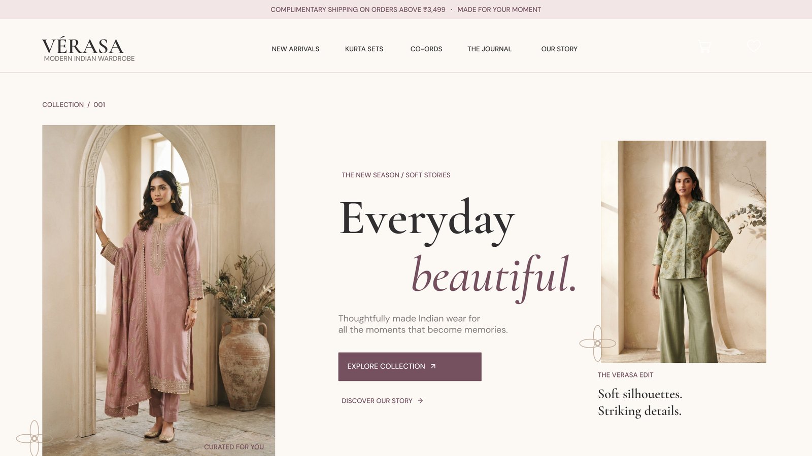
Vérasa homepage hero

"A beautiful shop is not enough. It has to help someone decide."

01 · the challenge

The brief, as given.

The brief provides goals and an audience. It does not include observed customer research or verified store analytics, so these figures are targets, not results.

business outcome+30%Online revenue target within six months
audience18–35Style-conscious Indian-wear shoppers and professionals
delivery12 weeksResearch to responsive e-commerce delivery
budget$15kDesign, development, QA and launch
02 · secondary research

What needs to be easier?

Published usability research gave me directional principles. These are not findings from VÉRASA customers.

01 · fit
Reduce sizing hesitation

Visible size options, a measurement guide, model details and availability on the product page. Source: Baymard, apparel product-page research.

02 · discovery
Make browsing intentional

Occasion, silhouette, fabric and price pathways alongside editorial inspiration. Source: Baymard, product-list and filtering research.

03 · checkout
Be transparent early

Expose total costs, delivery estimates, guest checkout and clear payment feedback. Source: Baymard, checkout usability.

04 · access
Beauty must be usable

Target WCAG 2.2 AA: semantic labelling, keyboard paths, visible focus and sufficient contrast. Source: W3C, WCAG 2.2.

SOURCES · baymard.com/lists/cart-abandonment-rate · baymard.com/research · w3.org/TR/WCAG22/

03 · research hypotheses

Two motivations, one storefront.

These proto-personas are hypotheses until user interviews validate them.

the explorer18–27 · inspiration-ledI want to find unique pieces that suit my mood and budget.

Friction: generic catalogue, hard-to-filter styles.

Response: occasion edits, swatches and saved styles.

the confident buyer26–35 · intent-ledI need to understand fit, fabric, delivery and cost before I buy.

Friction: ambiguous fit, fulfilment surprises.

Response: size guide, fabric details and cost clarity.

04 · customer journey

Design for a decision, not just a scroll.

A proposed end-to-end journey, to be validated in moderated usability sessions.

Discover: see an occasion or edit→ Browse: filter and compare, size stays visible→ Evaluate: check fit and fabric beside the CTA→ Commit: review costs and timing, no surprises→ Pay: complete as a guest ✓
05 · priorities

What ships in 12 weeks?

MoSCoW-style scope reduction keeps complex personalisation and AI features out of the first release.

P0 · must
The core purchase path

Responsive homepage, product list and filters, product imagery with a fit guide, cart and checkout, delivery expectations, accessible forms.

P1 · should
Confidence boosters

Wishlist, alternate product views, related collections, clear status messages, saved filters, improved search suggestions.

P2 · next
Later releases

Virtual try-on, an automated stylist, a loyalty wallet, a personalisation engine, a community-generated lookbook.

the storefront

Editorial energy, without conversion friction.

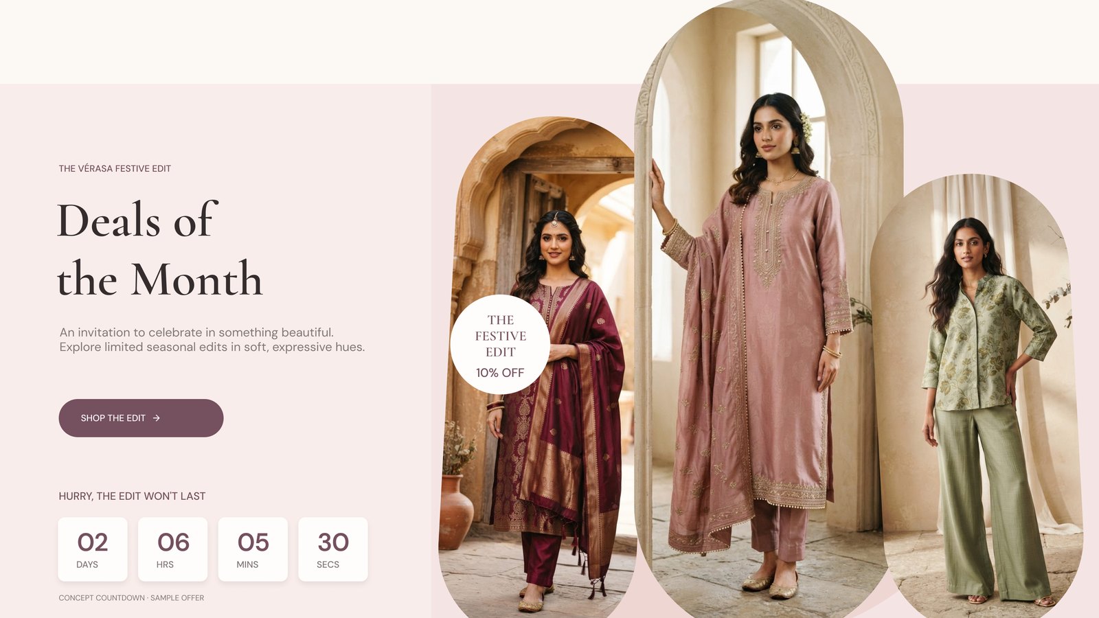
Reference-led visual iteration: a 3-column product grid, compact ratings, layered campaign imagery, a four-unit offer timer and a trending lookbook.

·
Homepage hero
Homepage

An editorial hero: 'Everyday beautiful.' with a clear path into the collection.

·
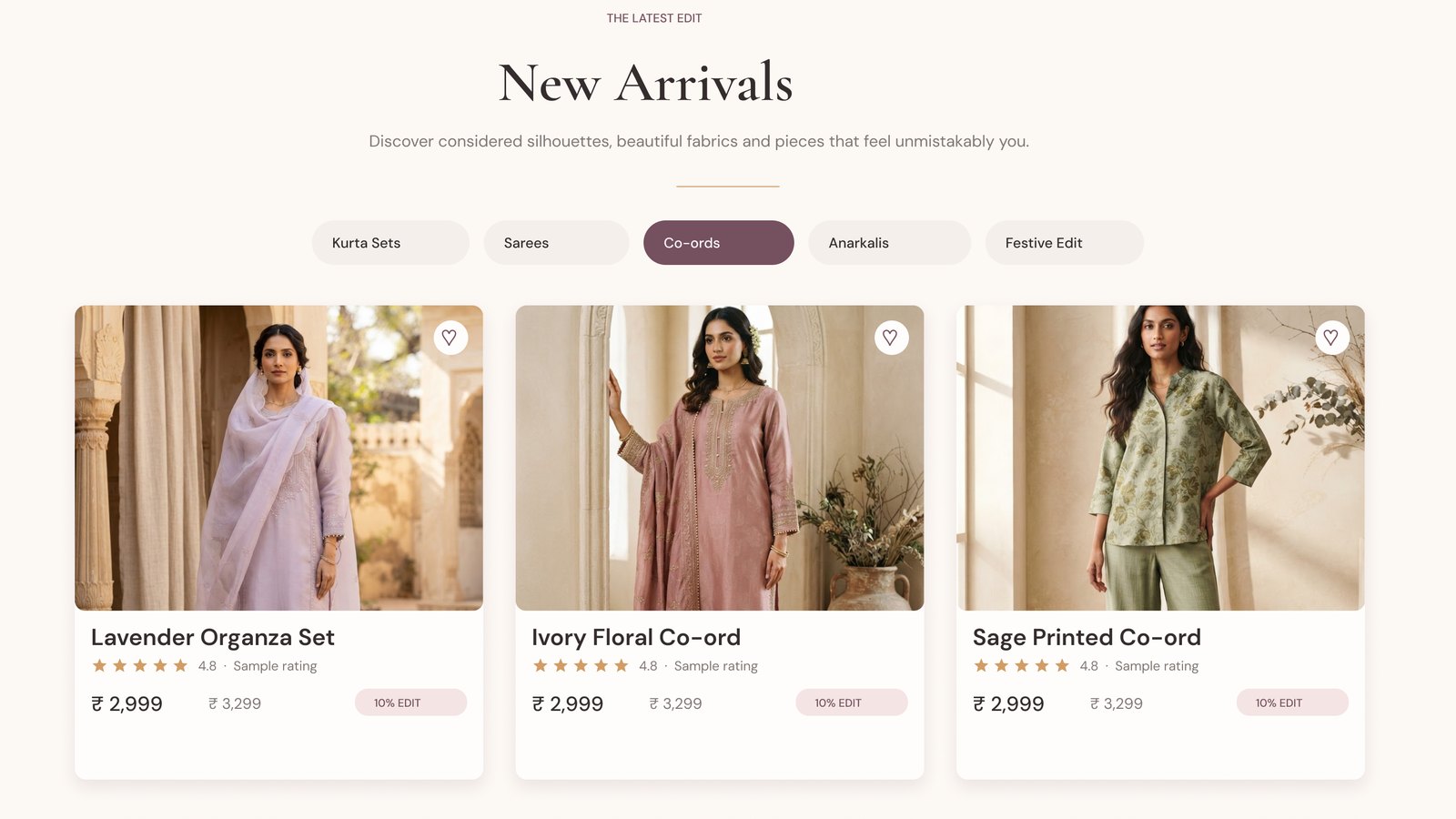
New arrivals grid
New arrivals

A 3-column product grid with category filters and compact ratings.

·
Deals of the month and trending looks
Campaign & lookbook

Layered campaign imagery with an offer timer and a trending lookbook.

·
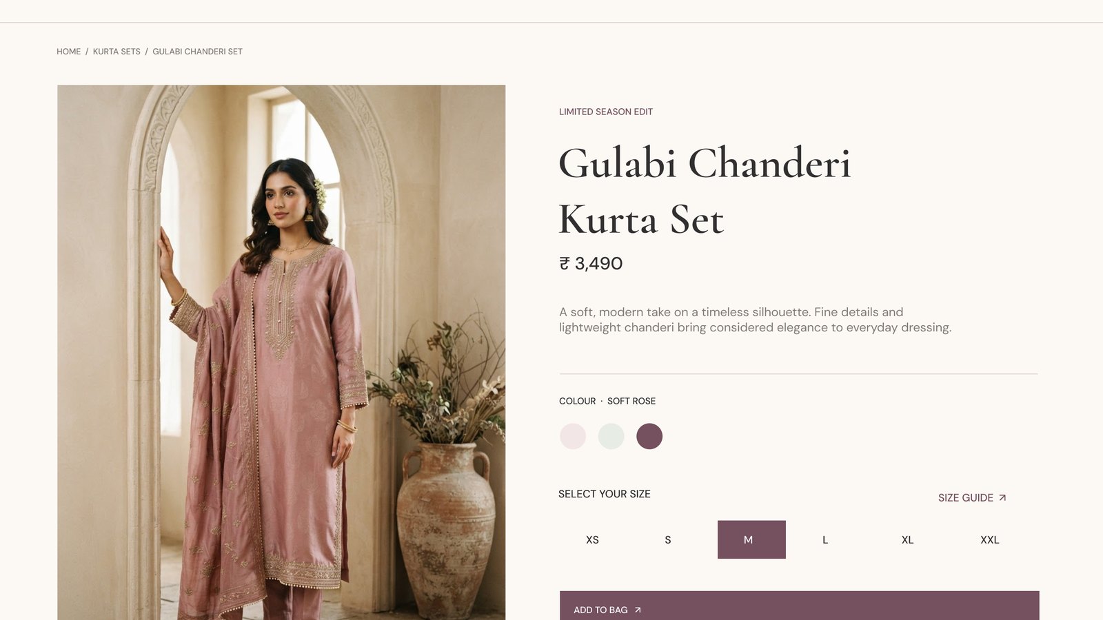
Product detail page
Product page

Colour, size and add-to-bag together, with fabric, shipping and fit details close by.

06 · product-specific sizing

Make size guidance part of the purchase.

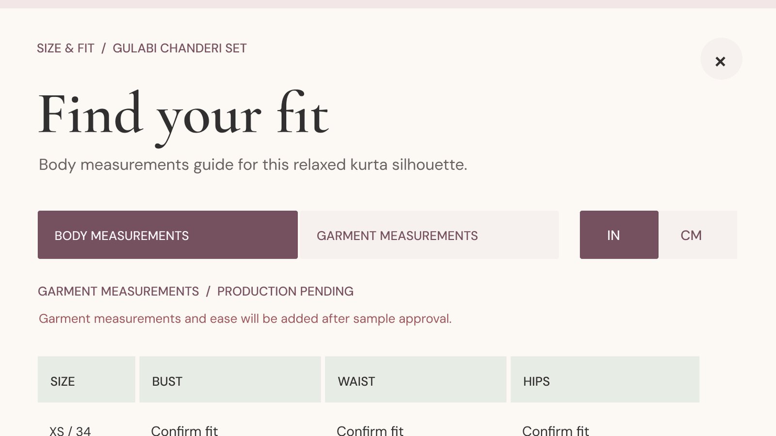
Design rationale from the size-guide references. The numeric chart is illustrative until production-approved measurements exist.

discoverability
Next to the size picker

Place the guide beside size selection so shoppers aren't sent away from the product page.

clarity
Body vs garment

Distinguish body measurements from garment dimensions and label units explicitly.

measurement
Inches and centimetres

Offer both units, fitting advice and simple anatomical callouts.

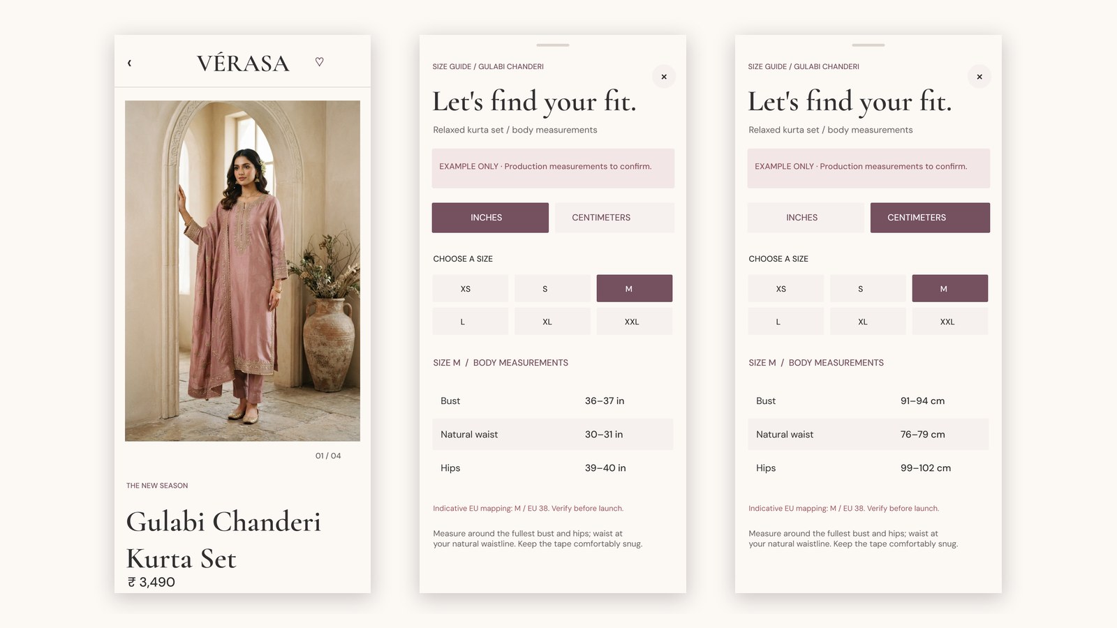
mobile
Bottom sheet

Use a bottom sheet and a selected-size summary rather than a wide table.

prototyping
Linked overlay states

Link Figma overlay states: open, swap units, body or garment view, close.

validation
Needs real data

Production chart, ease, model statistics and return policies need real source data.

SOURCES · baymard.com/research-articles/apparel-size-information · nngroup.com/articles/sizes-measurements-ecommerce/
HANDOFF · Browser Back must dismiss an open size guide and preserve PDP scroll; size tables need verified body and garment measurements.

·
Desktop size guide
Size guide, desktop

Body and garment tabs, inch/cm toggle and a how-to-measure panel.

·
Mobile product page and size guide
Size guide, mobile

A bottom sheet with the selected size summarised, in inches and centimetres.

checkout

Transparent early, simple at the end.

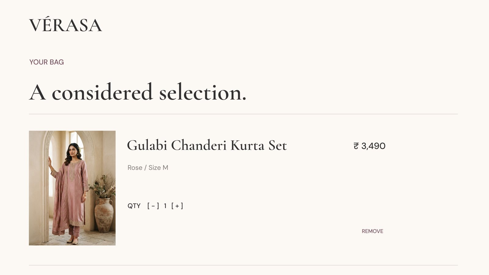
·
Shopping bag
Bag

A considered selection: cost and shipping stated plainly.

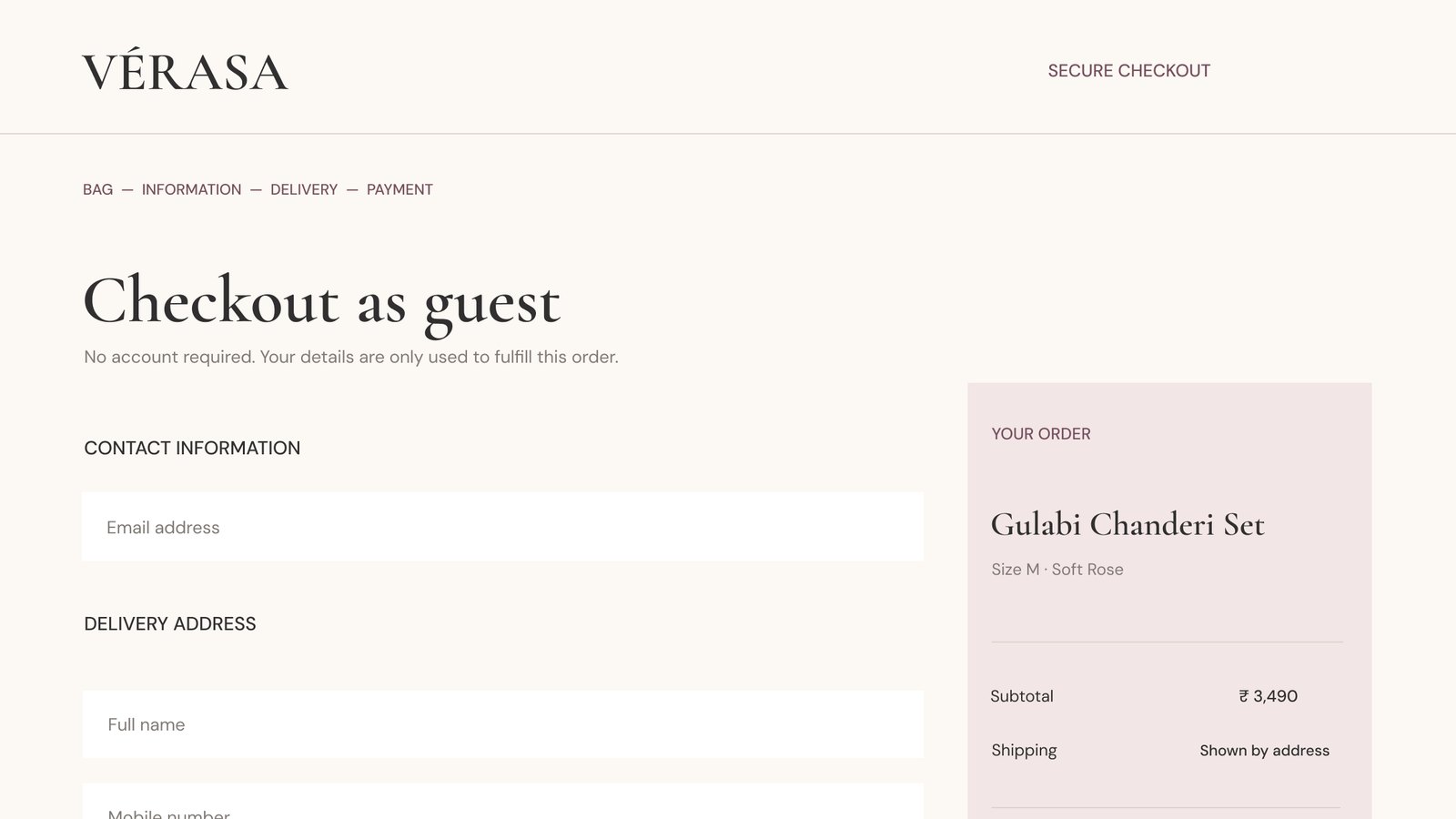
·
Guest checkout
Guest checkout

No account required, with the order summary always visible.

design language

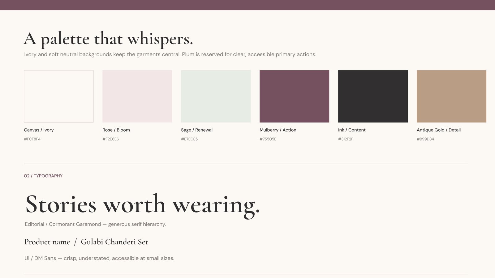
A palette that whispers.

Ivory and soft neutral backgrounds keep the garments central. Plum is reserved for clear, accessible primary actions. Cormorant Garamond sets the editorial voice; DM Sans keeps the UI crisp at small sizes.

Canvas / Ivory#FCF8F4
Rose / Bloom#F2E6E6
Sage / Renewal#E7ECE5
Mulberry / Action#75505E
Ink / Content#312F2F
Antique Gold / Detail#B99D84
·
Vérasa design language
Design language

Palette, typography, reusable UI and interaction states.

07 · success metrics

Revenue is an equation.

The 30% target must be evaluated against baseline traffic, seasonality and average order value.

Revenue=Sessions×Conversion rate×Average order value
discovery
Are people browsing well?

Category engagement, PLP to PDP progression.

confidence
Are they sure?

Size-guide use, add-to-cart, returns reasons.

completion
Do they finish?

Guest checkout, checkout completion, cost-related drop-off.

08 · validation plan & handoff

Show the work behind the pixels.

Research and product assumptions need testing before claiming any improvement in conversion. This is the plan, not completed work.

1
6–8 qualitative interviews

exploreOccasion-led shopping, sizing language and purchase confidence.

2
5–8 task-based tests

testCollection discovery, PDP sizing, cart, guest checkout.

3
Analytics & accessibility

instrumentFunnel instrumentation, mobile QA, WCAG 2.2 AA review.

4
Post-launch experiments

measureCompare matched-period revenue and conversion, segmented by device.

design disclosure

VÉRASA is a fictional brand built as a research-led portfolio concept. Product ratings, offer timing and campaign storytelling are illustrative states, not observed customer or sales data. The photography is creative concept imagery, and the offer countdown would need a real campaign end date and front-end logic. No interviews, analytics or business outcomes are claimed as completed.

next stop

Alibi

A reflective finance product that turns statement data into monthly clues.

Read next →
← back to work ALB · RESHMA · FinTech · Behavioural Finance · SaaS Ongoing project

From an ordinary transaction to a clue you can carry.

start with one month. see what Alibi notices about you.

Alibi is a behavioural finance product that reads UPI and bank statement data and turns ordinary transactions into meaningful clues — surfacing recurring behaviours, spending leaks, EMI stress, and habits that usually go unnoticed. It reads like a monthly story, not a budgeting dashboard.

roleProduct Thinking · UX Strategy · IA
statusOngoing project
toolsFigma · Notion · AI-assisted research
platformMobile-first web app
Product StrategyUX DirectionInformation ArchitectureBehavioural Insight Design
Alibi2026
Upload a statement or try sample data
•••• 42
•••• 88
•••• 15
"Your Tuesdays are unusually heavy this month.Clue 03

"People can see where their money went. They rarely understand the behaviour behind it."

the problem

Users can view their transactions, but often miss the behavioural patterns behind their spending — the recurring habits, quiet leaks, and unclear transfers that don't show up on a statement.

product direction

A reflective finance experience that transforms raw transaction history into monthly summaries, spending insights, behavioural patterns, and next-month watchlists — privacy-first, and built around awareness rather than budgeting rules.

what's live now

  • Starts with one month of statement data — no account linking or bank API required
  • Upload a real statement or explore with sample data first
  • Statement support currently spans HDFC Bank, ICICI Bank, State Bank of India, Axis Bank, and Kotak
  • In progress: upload flows, transaction classification, monthly insight stories, EMI stress checks, and behavioural pattern views

my role

Product thinking, UX strategy, and interaction design direction — shaping the information architecture and the behavioural insight experience from the ground up.

early product preview

A first look inside Alibi.

Screens from the live Alibi site.

01
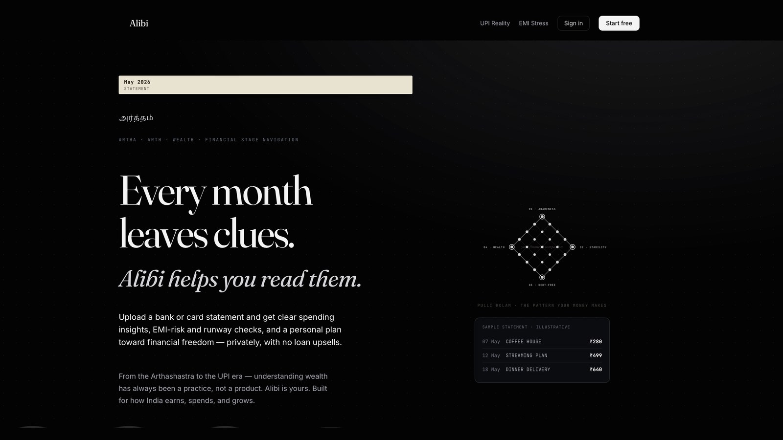
Alibi landing page
Landing

“Every month leaves clues.” Upload a statement and get spending insights, privately.

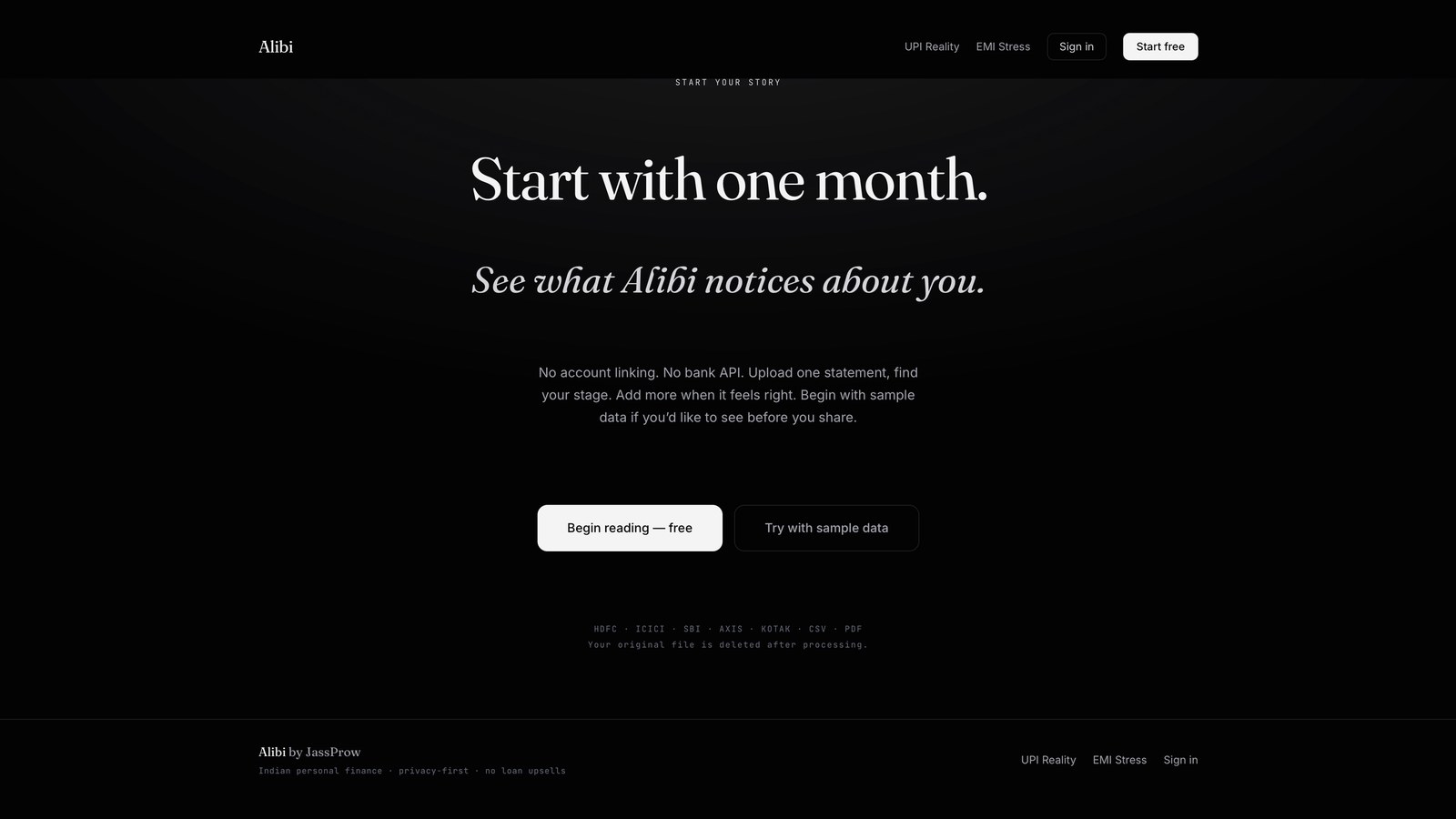
02
Alibi start your story
Start with one month

No account linking, no bank API. Begin free or try sample data.

03
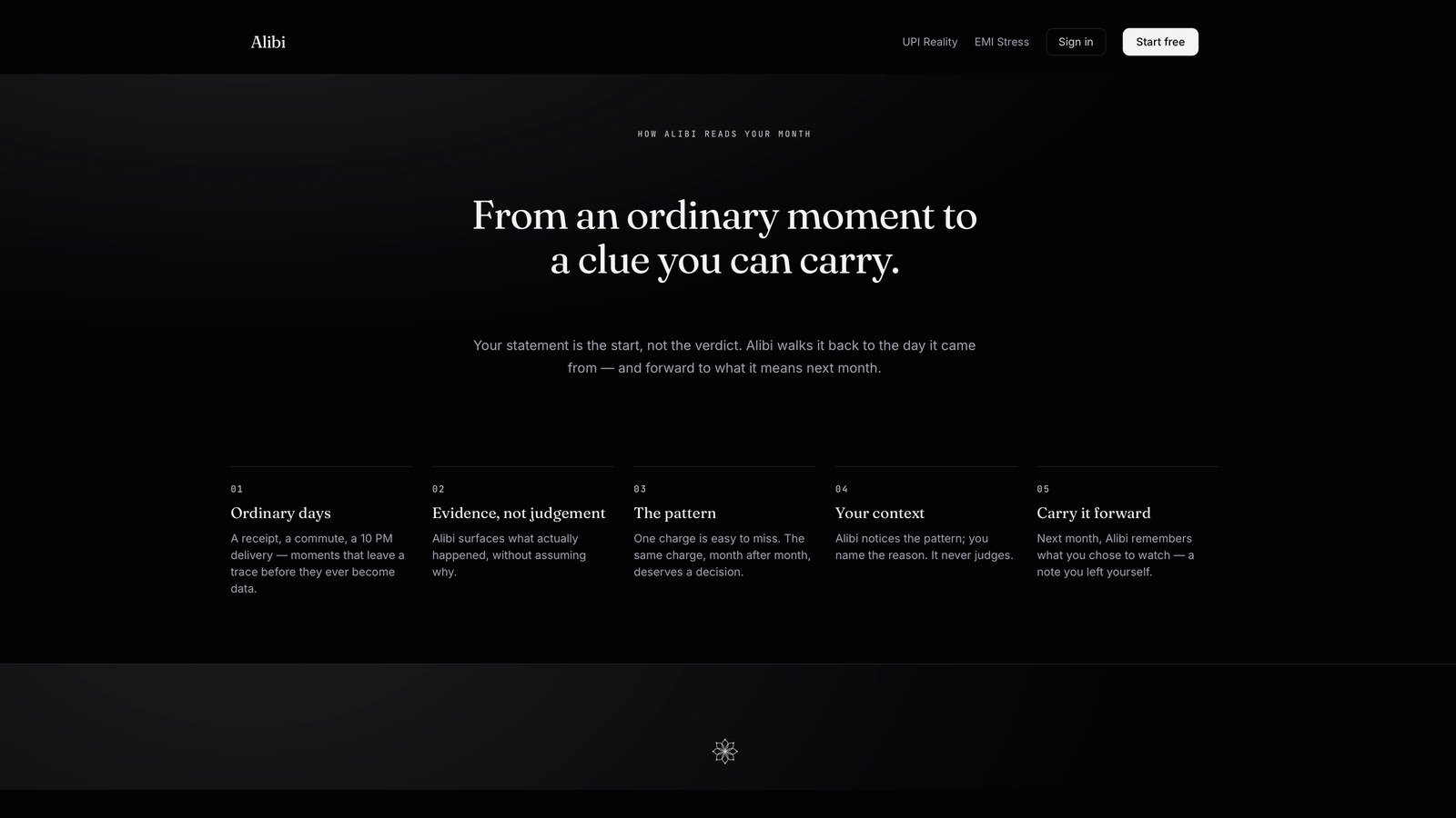
How Alibi reads your month

Five steps from an ordinary moment to a clue you can carry.

04
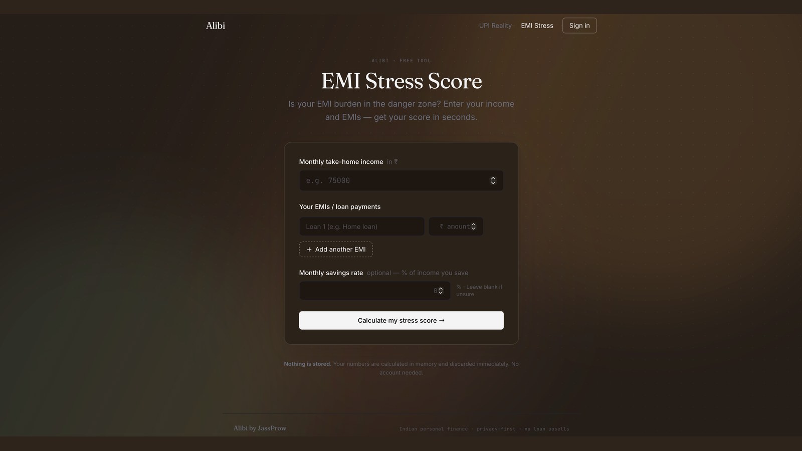
Alibi EMI Stress Score
EMI Stress Score

A free tool that scores your EMI burden from income and loans.

ongoing project — interface, flows, and product scope are still evolving.

next stop

Water Tourism

A speculative design project imagining water tourism in 2032.

Read next →
← back to work WTR · RESHMA · Speculative Design · Futures Research

Imagining water tourism in 2032, one what-if at a time.

how might Gen Z feel bonded to water?

A speculative design project built on STEEP research, future forecasting and what-if ideation. We imagined how water tourism could look in 2032 and designed a two-day water fest that helps people connect with water and use it more mindfully.

teamReshma Shirin, Hela & Ananth
my roleResearch · Future forecasting · Ideation · Concept development
horizon2032
typeSpeculative design
STEEP ResearchFuture WheelTimeline in a ConeWhat-If IdeationStoryboarding
STEEP · 20322032

"How might we make Gen Z form a sense of bonding with water to make them more mindful about its usage?"

the brief

Water tourism, ten years out.

We ran STEEP research (Social, Technological, Economic, Ecological, Political) to find the trends likely to shape water tourism over the next decade, from water sustainability to changing tourism practices.

01
Seek healthy alternatives

Consumers increasingly look for health-conscious and environmentally friendly tourism options.

02
Sustainable choices

Sustainability, sourcing and vegan-friendly choices will influence the future of water tourism.

03
Non-alcoholic flavours

Gen Z and later generations will lean toward complex non-alcoholic flavours and healthier drinks and experiences.

future forecasting

Three tools to map what could happen.

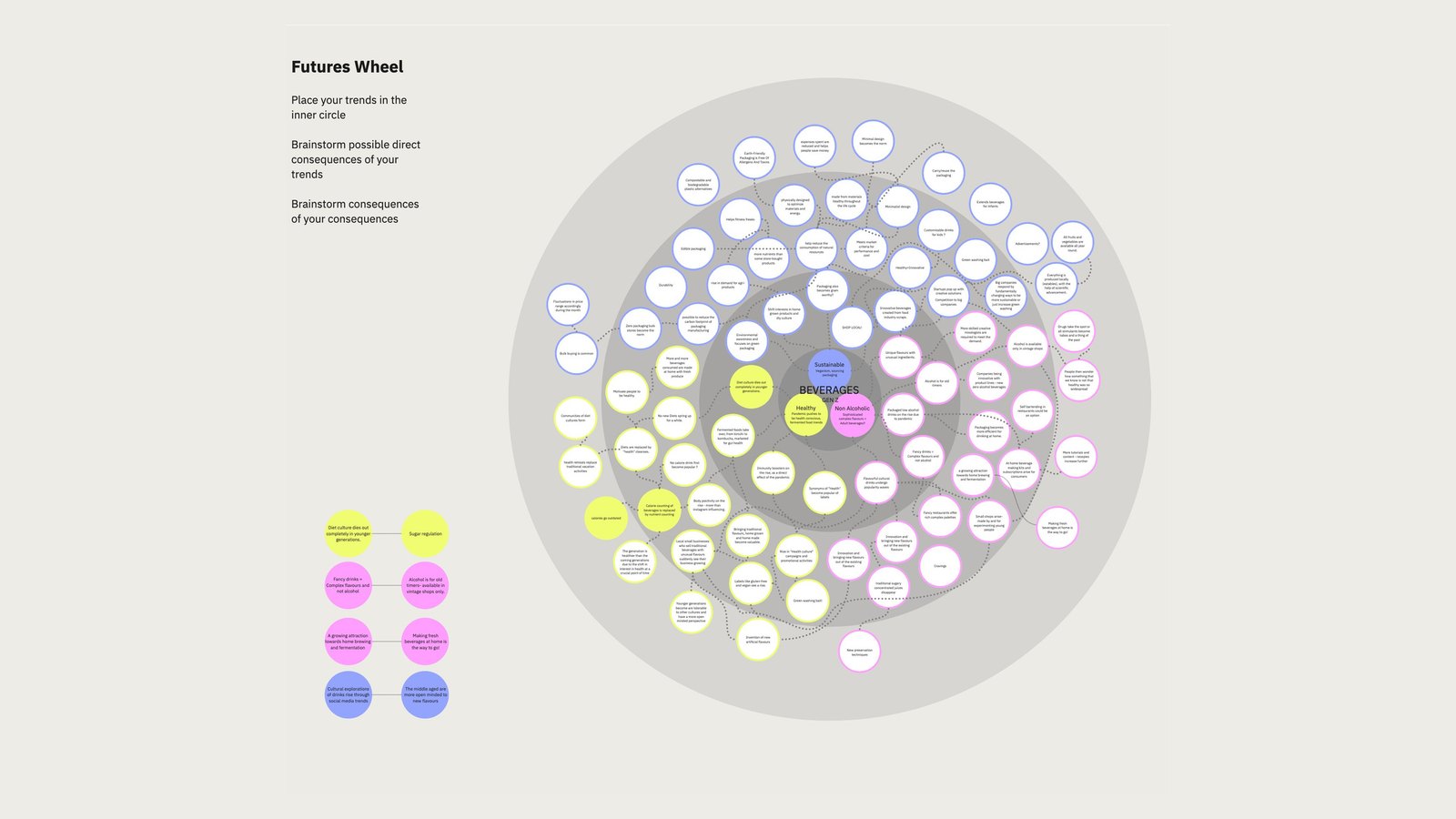
Future Wheelripple effects

Trends such as non-alcoholic drinks, sustainability and health-conscious tourism sat at the centre. The wheel mapped their direct and indirect consequences and showed how consumer behaviour and sustainable practice interconnect.

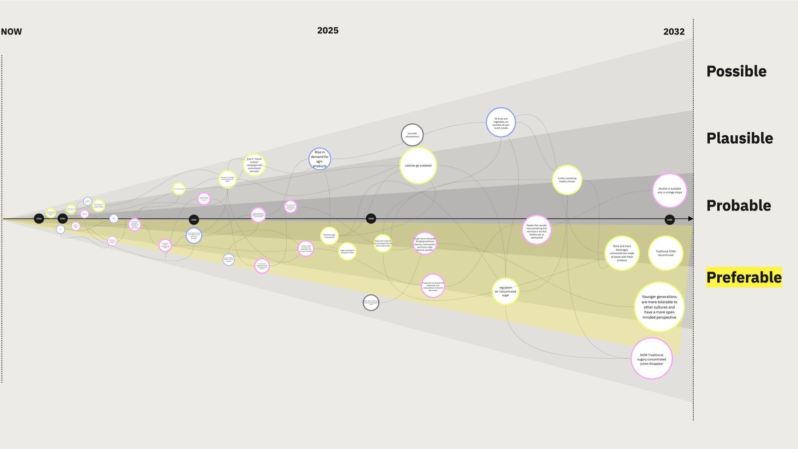
Timeline in a Conepossible → preferable

Sorted futures by time, likelihood and desirability from 2025 to 2032, giving a structured view of how wellness and eco-friendly tourism could become part of the industry.

End statessnapshots of 2032

Speculative outcomes such as alcohol-free tourism, home-brewed drinks, health-conscious alternatives and more adventurous experiences.

ideation

From trends to tangible artifacts.

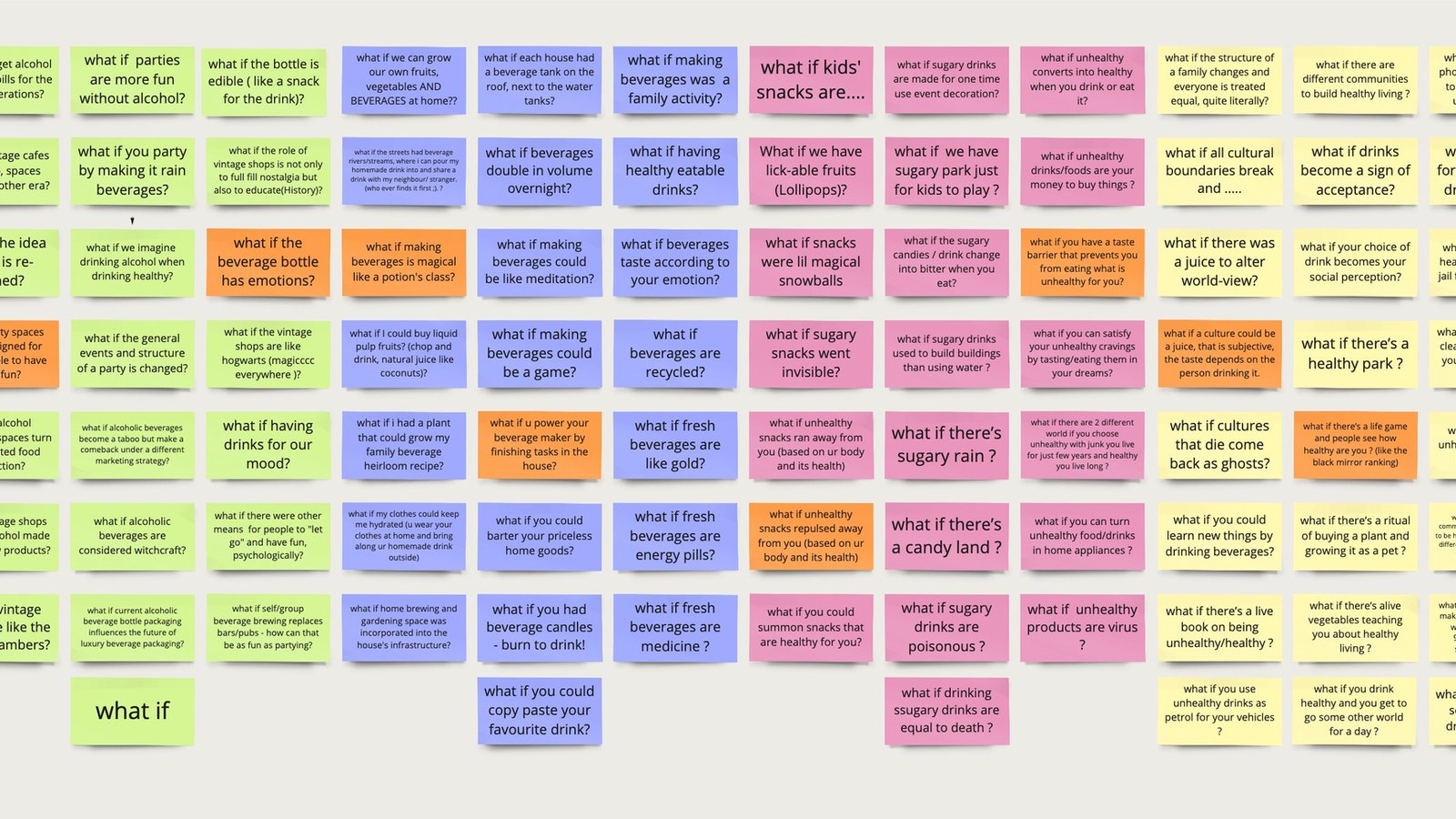
What-if scenarios questioned cultural norms and existing assumptions. The process then followed four steps, from analysing today to making speculative ideas concrete.

Analyze: spot current trends→ Fantasize: explore what-ifs→ Concrete: make scenarios actionable→ Realize: build objects and experiences ✓

artifacts & interviews

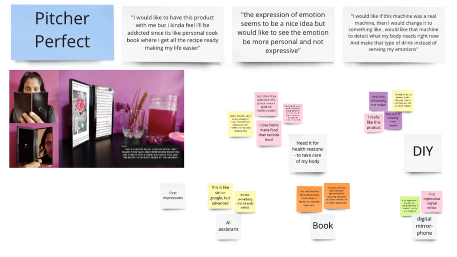
Three key artifacts came out of the what-if ideation. We tested and refined them through user interviews to understand how people reacted.

the insight

Those interviews led to the question that drove the final concept: how might we make Gen Z form a sense of bonding with water, so they become more mindful about its usage?

final concept

The Water Tourism Fest.

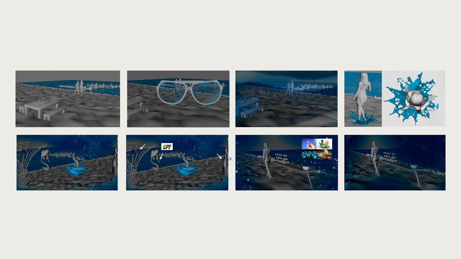
A two-day night fest held by a prominent water body, celebrating humanity's connection with water, where technology and art blend.

1
VR integration

on arrivalVisitors receive VR glasses that show water particles floating around them and let them interact with digital water.

2
Immersive water visuals

in the headsetWater surrounds the visitor, with ripples they can move in sync with.

3
Interactive NFTs

on the beachVisitors submit water-related art to be displayed as NFTs.

4
Water-themed food & drinks

on the menuOnly water-based food and drinks are served, which deepens the theme.

5
Dynamic environment

interactionWhen mist covers the visitor's view, they shake their head to clear it.

process & concept in pictures

From the wheel to the storyboard.

·
Future Wheel
Future Wheel

Mapping direct and indirect consequences of 2032 trends.

·
Timeline in a Cone
Timeline in a Cone

Possible, plausible, probable and preferable futures, 2025 to 2032.

·
What-if ideation wall
What-if ideation

A wall of what-if prompts challenging cultural norms.

·
Pitcher Perfect artifact interviews
Artifact interviews

User reactions to one of the three artifacts.

·
Water Tourism Fest storyboard
Storyboard

The visitor journey through the Water Tourism Fest.

·
Water Tourism Fest concept scene
The concept

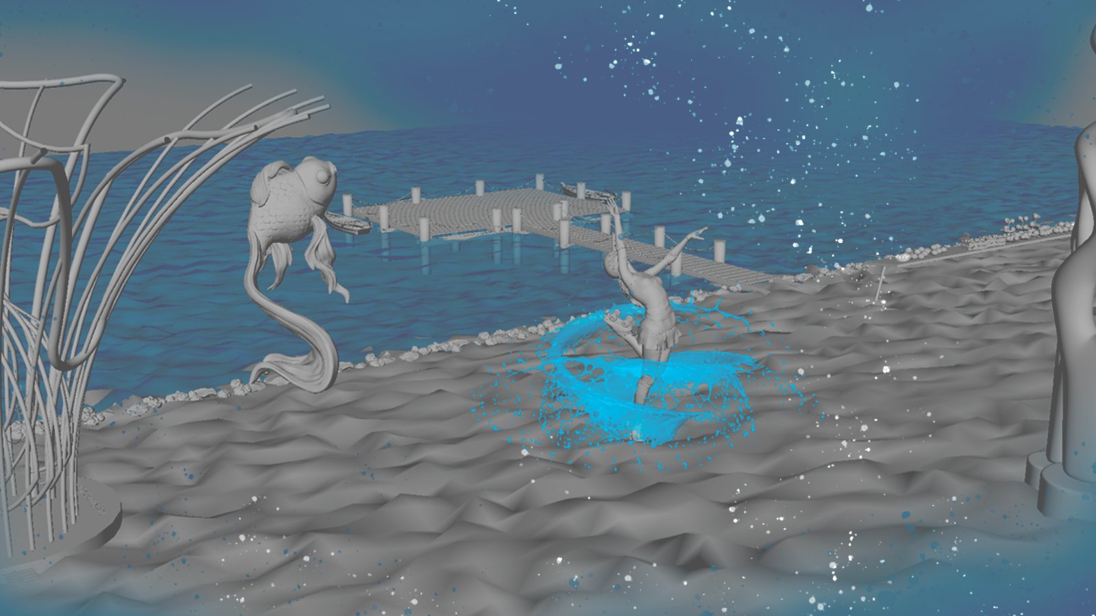
A VR view of the fest: water, ripples and art on the beach.

intended impact

An immersive two-day experience that helps participants form a personal connection with water. Through art, VR and interactive installations, visitors gain a renewed understanding of why water matters and how they use it.

my contribution

Research, future forecasting, ideation and concept development, working with teammates Hela and Ananth.

speculative design project — the fest is a proposed future scenario, not a built or tested product.

next stop

Beyond Design

Social creatives, illustrations and experiments made for the joy of it.

Step inside →
← back to work BYD · RESHMA · Creative Corner · Social Creatives & Illustration

Where the illustrations live.

made for joy, not deadlines

Every designer needs a corner with no brief, no stakeholders, and no acceptance criteria. This is mine — social creatives, illustrations, and playful experiments that keep my eyes fresh and my hands honest. Some of it feeds back into client work. Most of it exists purely because making things is fun.

mediumSocial creatives · Illustration · Logos · 3D modelling
toolsIllustrator · Photoshop · Autodesk Maya
statusAlways growing
rulesNone
IllustrationSocial CreativesBrandingLogo Design3D ModellingExperiments
Glass chess set 3D render

"The sketchbook is where taste gets built — one unjudged page at a time."

illustration

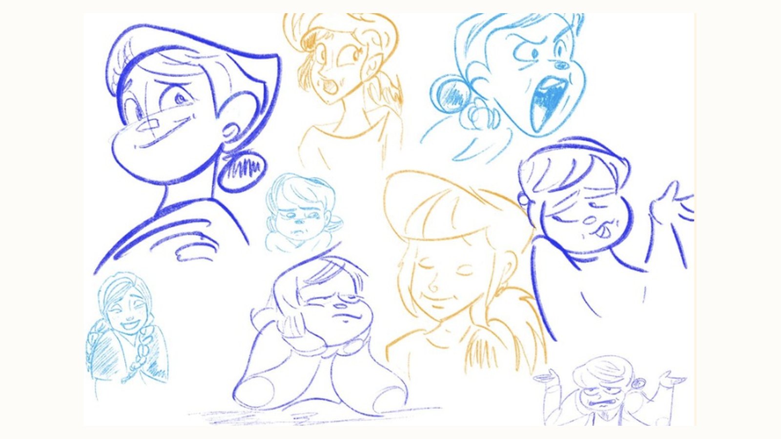
Characters, drawn for fun.

Expression and pose studies, drawn digitally in Photoshop.

05
Sketchbook page of character expressions
Character sketchbook

Expression and pose studies in coloured pencil style, drawn digitally in Photoshop.

posters & social creatives

Posters & posts.

Social creatives for food, café and dental brands, made in Photoshop and Illustrator.

01
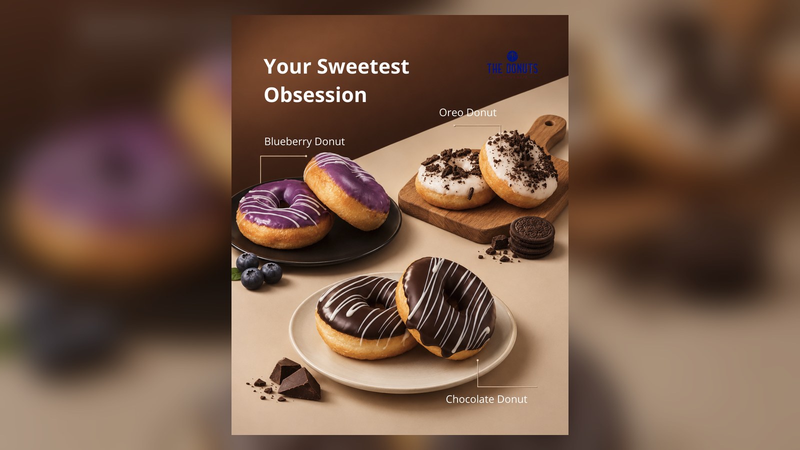
Your Sweetest Obsession donut poster
Your Sweetest Obsession

Social poster for The Donuts Bakery & Café: three donut flavours with labelled callouts.

02
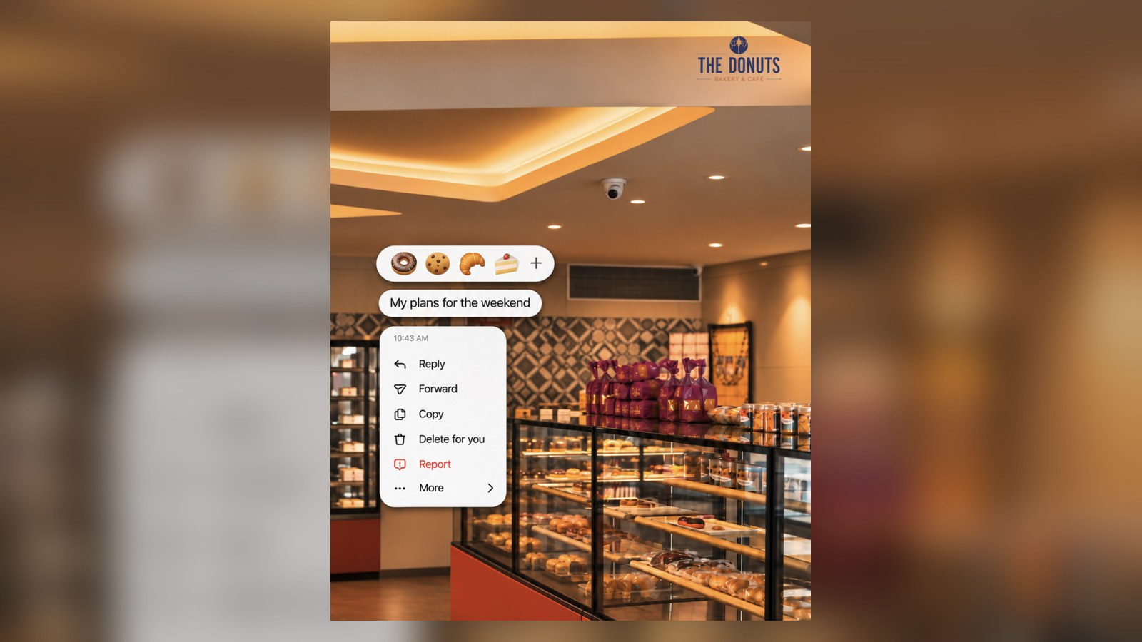
The Donuts bakery interior post
Weekend plans

A bakery interior paired with a playful messaging-app menu.

03
A Little Indulgence Never Hurt poster
A Little Indulgence Never Hurt

Dark, golden chocolate cake poster with an order call to action.

04
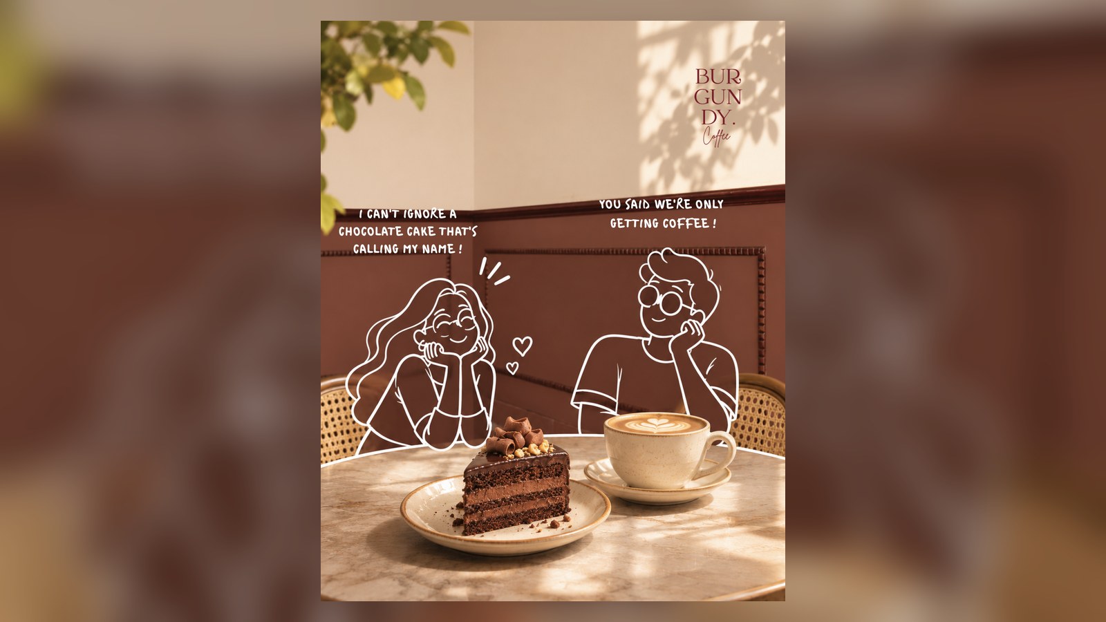
Burgundy Coffee illustrated post
Burgundy Coffee

Line-art characters added over a café photo to give the post a story.

06
V'Smile coming soon social poster
V'Smile · launch teaser

A “We are coming soon” social creative in the brand’s blue palette.

branding & logo work

Logos, explored before they’re chosen.

Wordmarks, symbols and announcement creatives, designed in Illustrator and Photoshop, showing the exploration as well as the final mark.

07
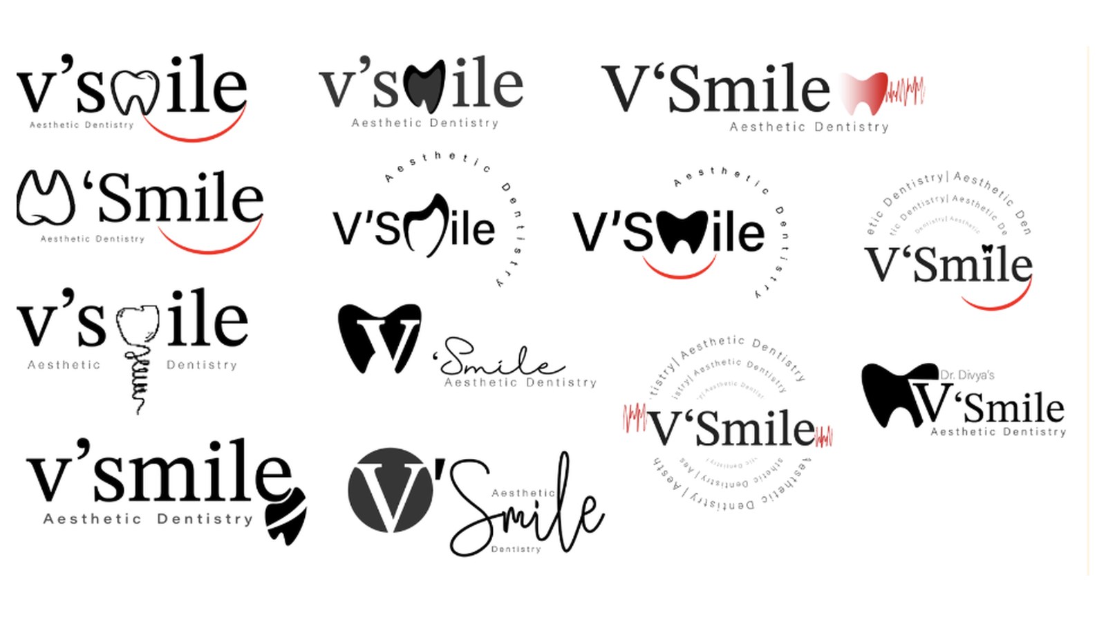
V'Smile dental logo explorations
V'Smile · logo exploration

Twelve directions for an aesthetic dentistry brand, combining a tooth, a smile curve and type.

08
V'Smile final logo
V'Smile · final mark

The chosen direction: a bold tooth form carrying the V, with an arched “Aesthetic Dentistry” line.

09
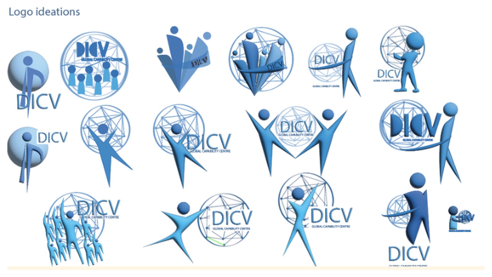
DICV logo ideations
DICV · logo ideations

Global Capability Centre mark explored through people, network and growth motifs.

10
Aura wordmark explorations
Aura · wordmark study

Script, serif and circular lockups in a warm brown palette for a beauty brand.

3D modelling

Built in Autodesk Maya.

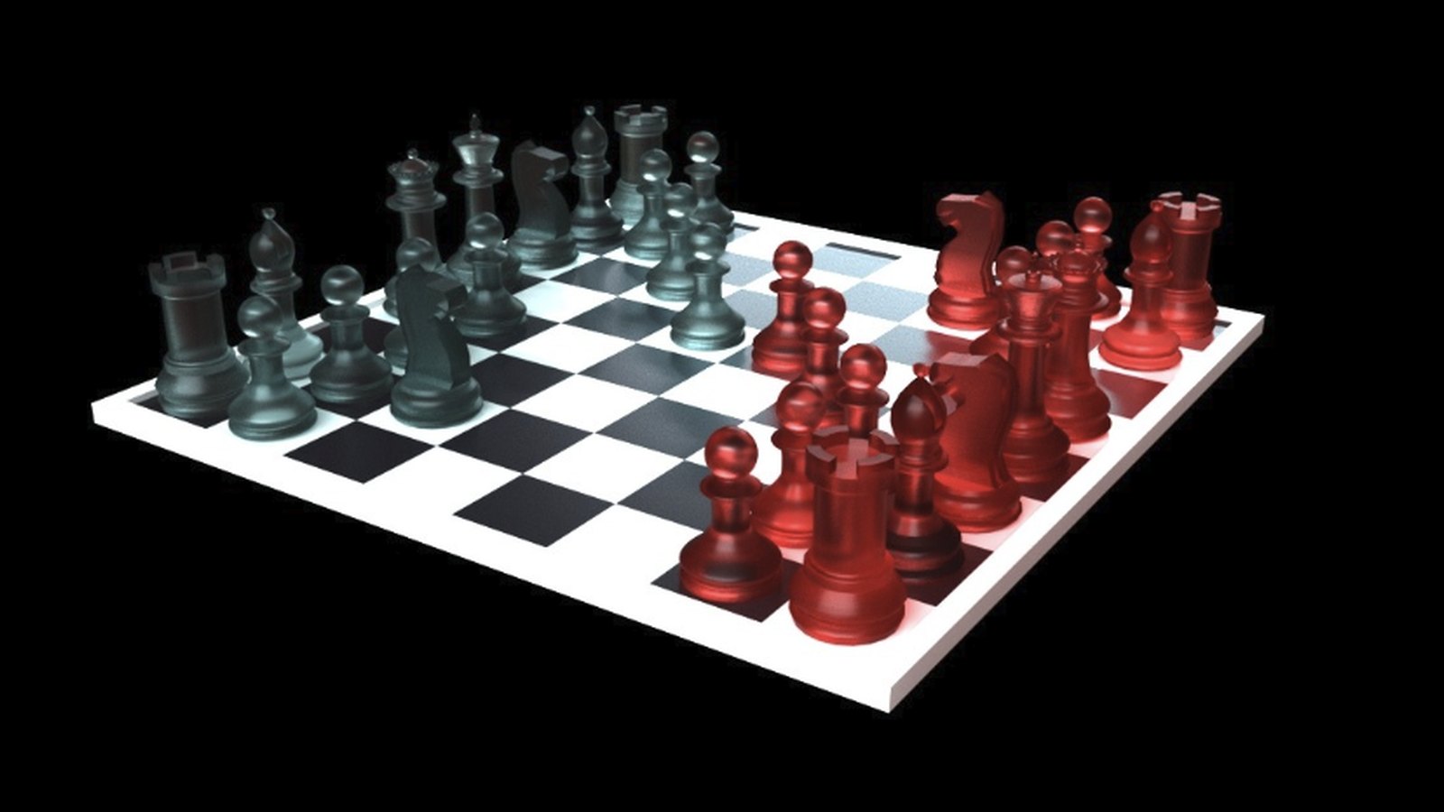
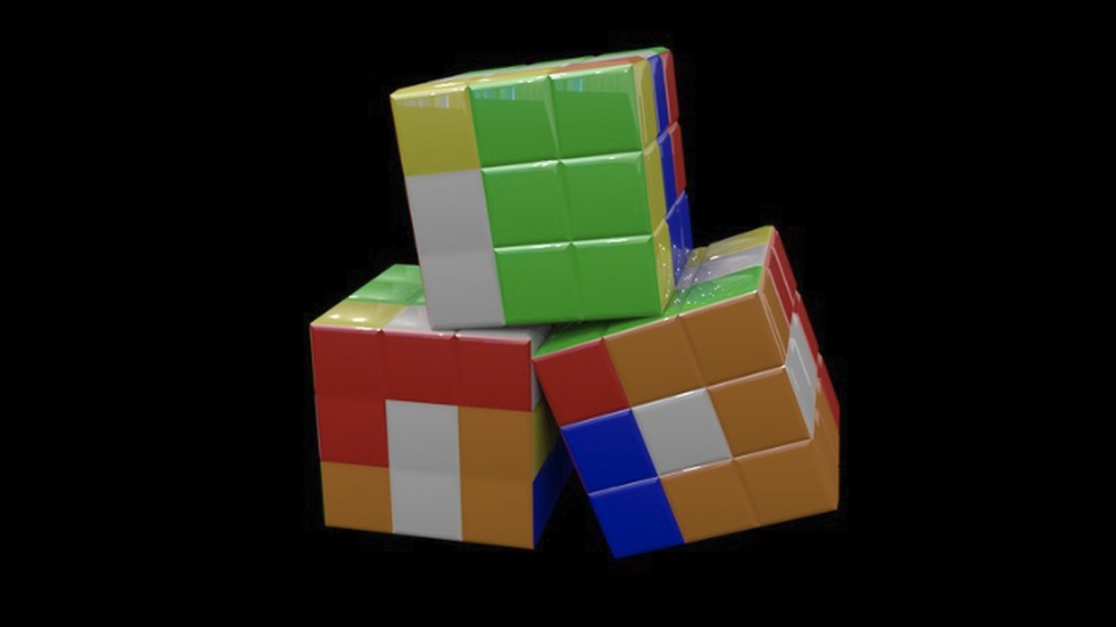
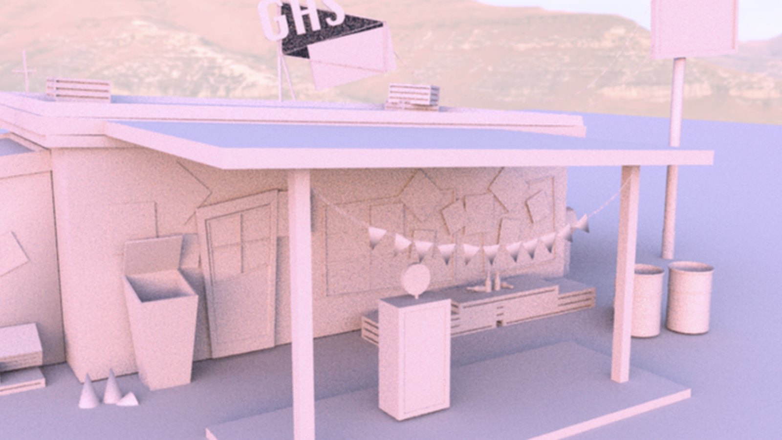
Modelling, lighting and rendering studies: a glass chess set, stacked cubes, a small roadside stand and a tiled bathroom.

11
Glass chess set render in Maya
Chess set · glass & red

Translucent teal and red pieces on a checkered board, lit against black.

12
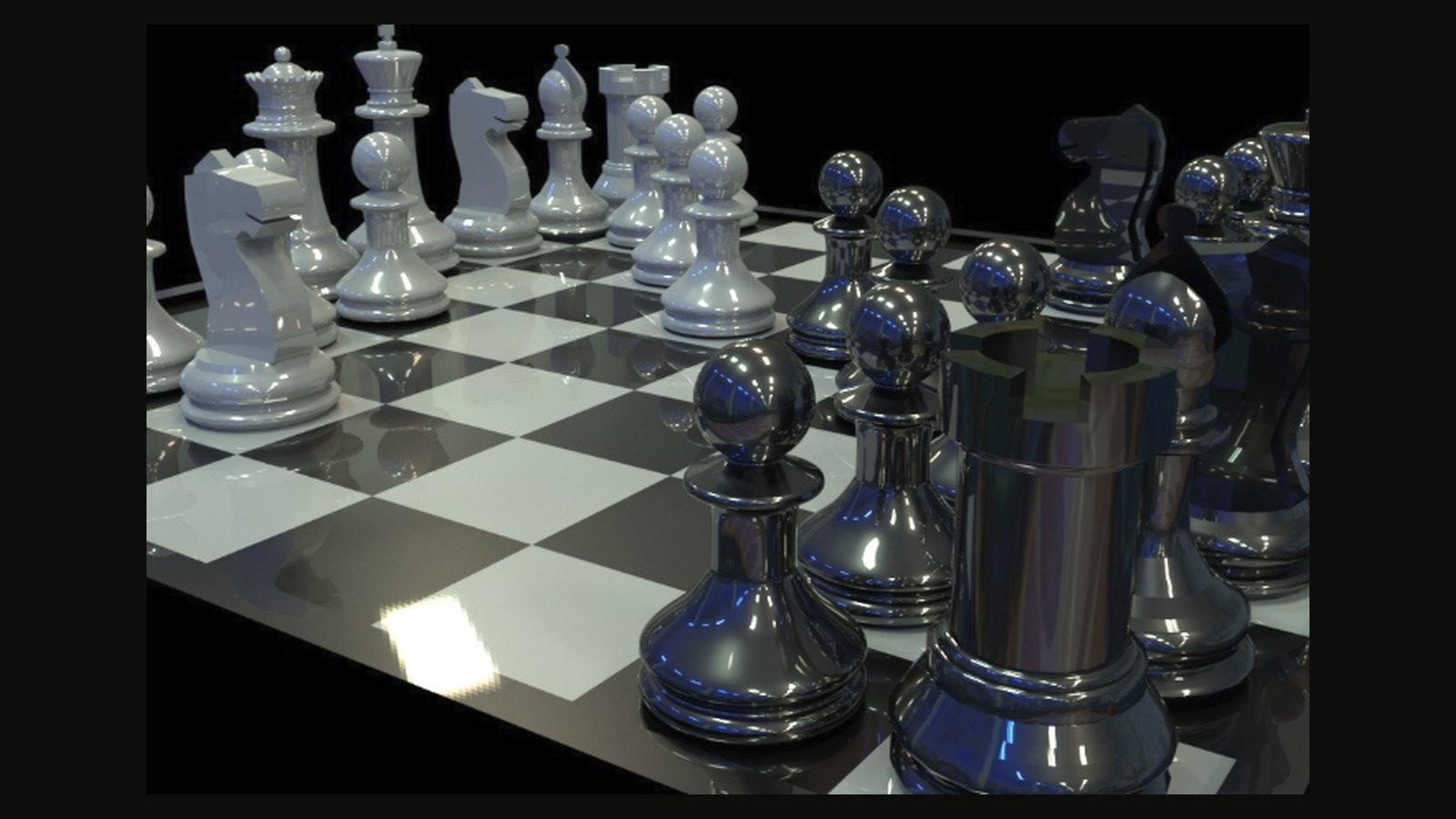
Close-up chess render
Chess set · close-up

Glossy white and chrome-black pieces with reflections on the board.

13
Stacked Rubik cubes render
Stacked cubes

Three puzzle cubes with glossy stickers, modelled and rendered in Maya.

14
Roadside stand 3D model
Roadside stand

A clay-style environment model with bunting, bins and a mountain backdrop.

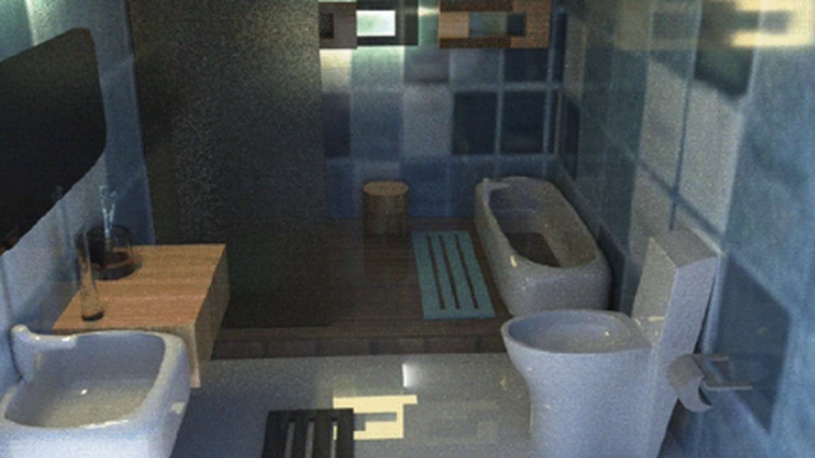
15
Bathroom interior render
Bathroom interior

Tiled walls, wooden fittings and soft window light, rendered in Maya.

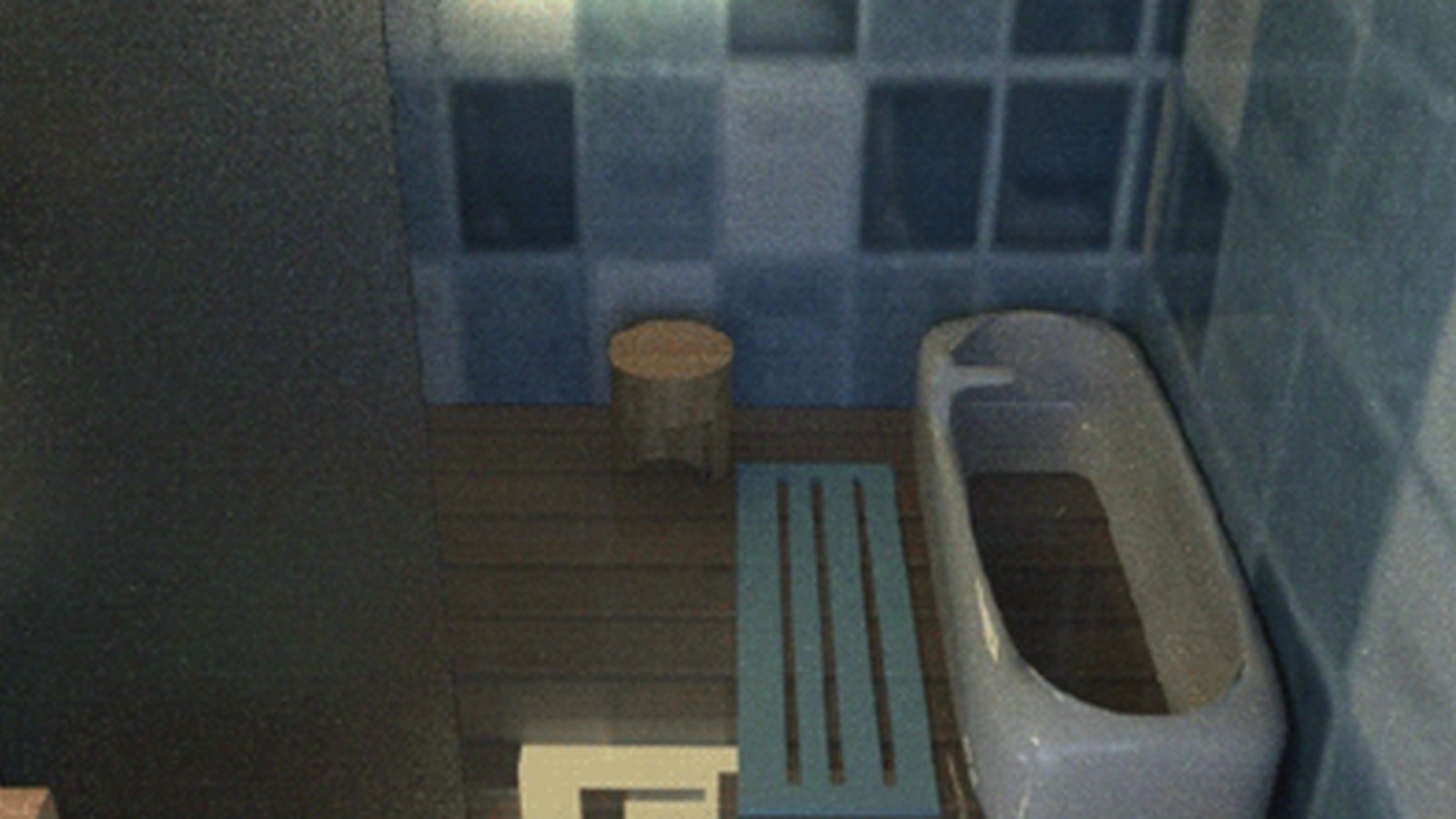
16
Bathroom top-down render
Bathroom · bath view

A higher camera angle showing the bath, mat and stool.

why it matters

Play is practice in disguise. Social creatives sharpen my eye for composition, copy and colour; illustration adds personality; making teaches restraint — what to leave out. The taste built here quietly shows up in every product I design.

what lives here

  • Hand-drawn illustrations and character sketches
  • Social posts and campaign creatives for food and café brands
  • Logo and wordmark explorations (Illustrator)
  • 3D models and renders (Autodesk Maya)
  • Poster, type, and texture experiments
  • Whatever this week's curiosity demanded
back to the start

VR for Migraine

Exploring VR for Relaxation During Migraine Episodes.

Read the case study →